
Eightyfive Spring/Summer ‘24 - Neutral Tones
Neutral Tones was the Spring/Summer Collection of 2024 and marked a departure from Eightyfive's typical streetwear aesthetic. This meant that prints had to be more subtle and toned down compared to previous collections. I worked on several artworks for this collection, some of which were created in collaboration with my colleagues.
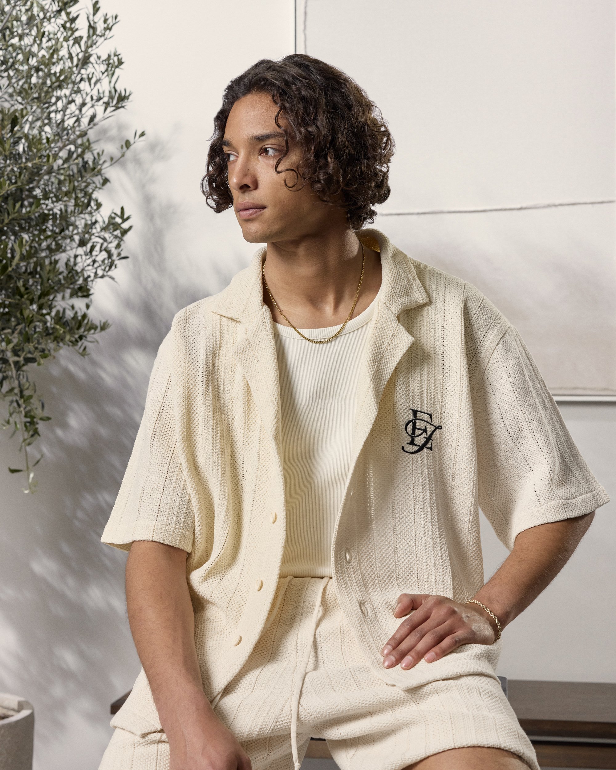
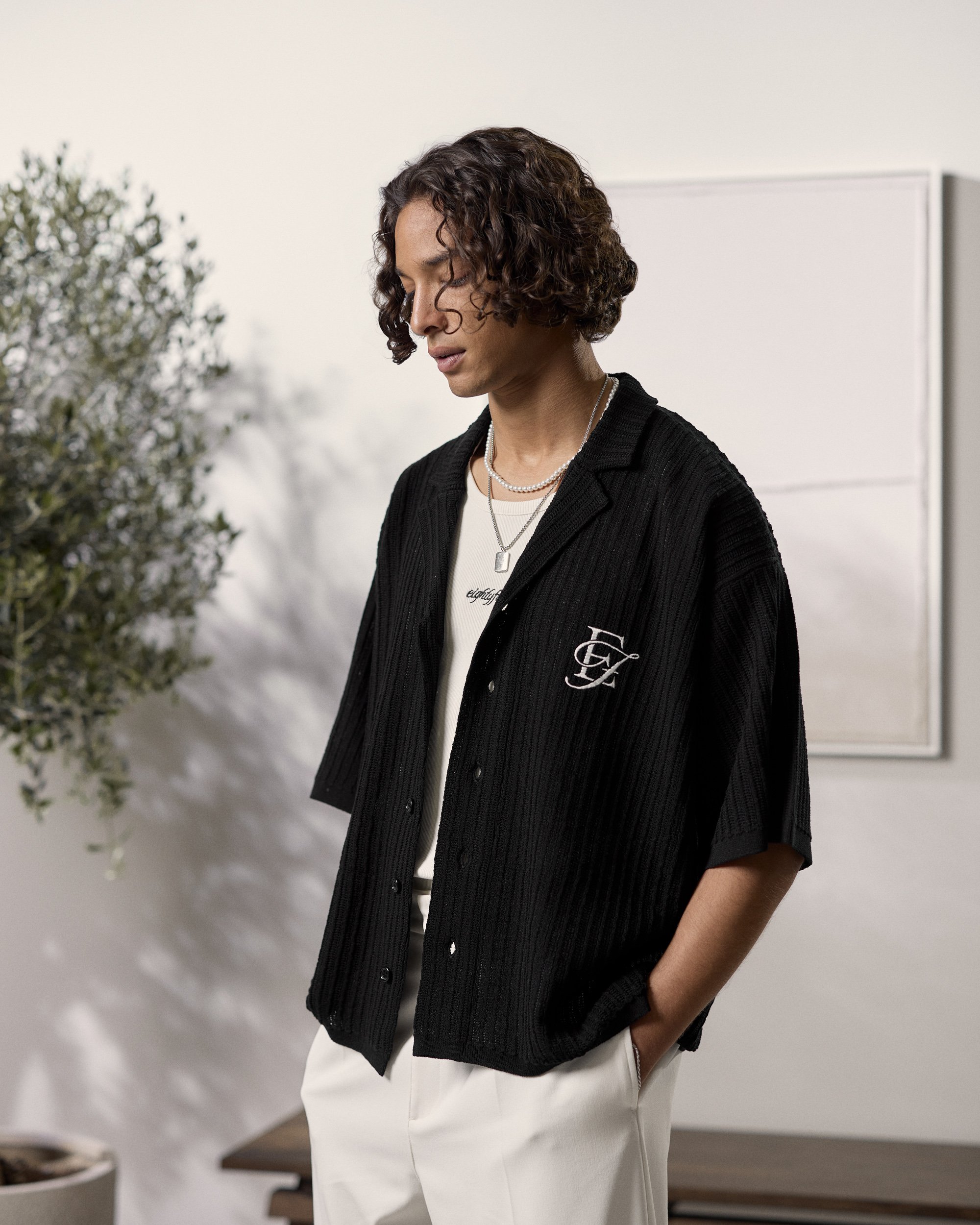
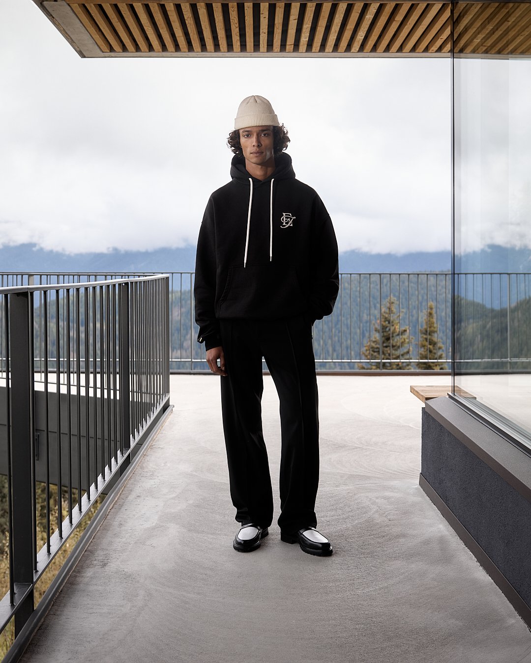
EF Initial Logo
For some time we wanted to have an initial logo for Eightyfive, which could be used across collections and would work as a timeless logo for many pieces. This logo was a cooperation between me and the head of my department. I created the overall composition of the E and the F and the final touches where made by my Head of.

The logo consists of a serif letter E and a script letter F. The combination of these two font styles create a really luxurious feel to this logo, which makes it work on many types of garments and give it a timeless character that underlines the aesthetic of the brand.
The logo can be found across multiple collections as you can see in the slideshow below.


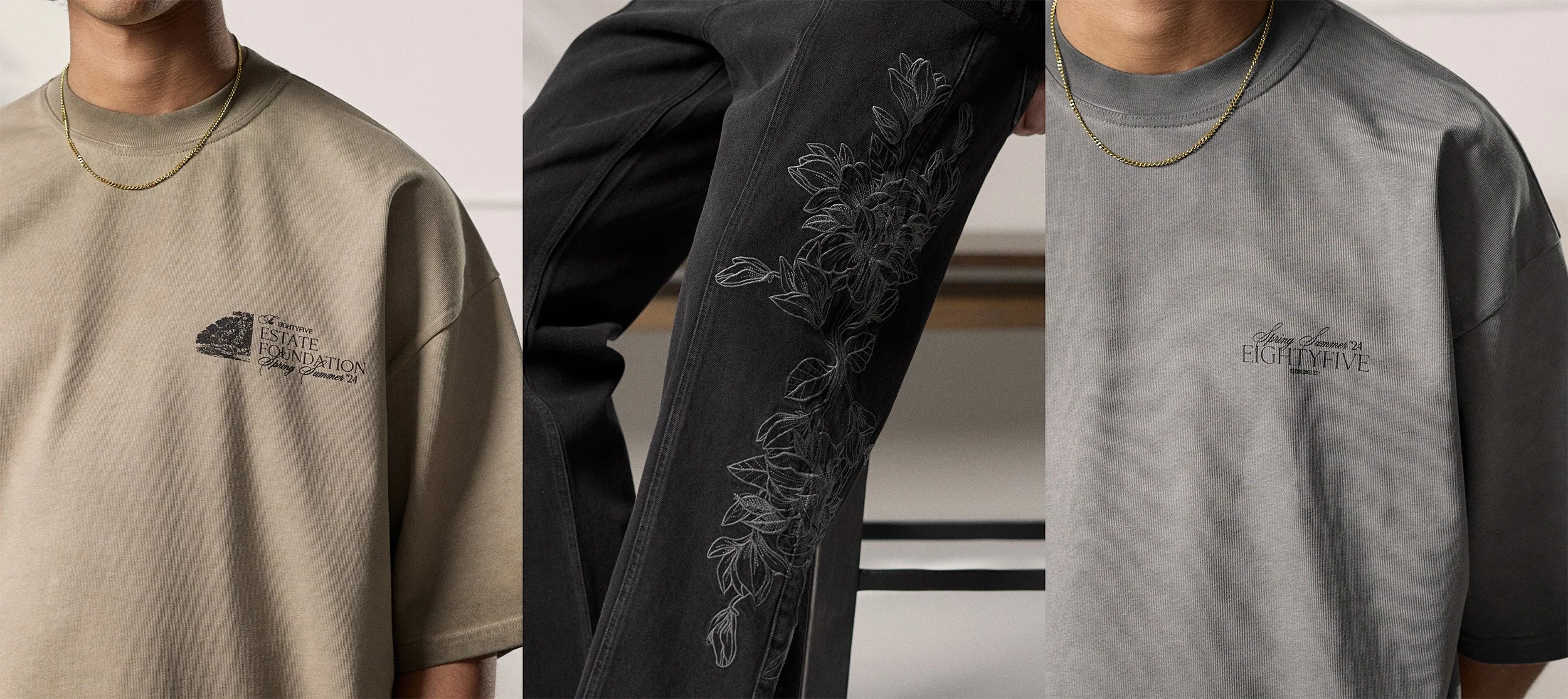
Flower Pattern
As already mentioned this collection really made a shift away from traditional streetwear and geared more towards a casual audience. Therefore we had to use more grown up and casual imagery for the motives. We used flowers as an object across many pieces since this collection and I really like how this pattern looks on the side of this denim.
To create this final artwork I modified a flower graphic I found online to perfectly fit across the leg of the pants

Smaller logotype designs
Below you’ll find two smaller complementery artworks I did for this collection. They’re both kind of similar to each other but still different from each other to have a bit of variety between the garments their on.


As you can see, both artworks are built on the same typographical foundation and use mostly the same fonts. I really like the idea of having two similar yet distinct prints on different colorways of the same shirt, adding unique details that make each piece stand out.
The first artwork was created with the help of on of my coworkers who did the final wording and arrangement of the text elements. I found the image on the left and built the overall layout of this artwork.
