Project Summary
Peso - Artists Collective Logotype
This piece was inspired by a work of figurative typography that struck me immediately. I liked the concept of letters coming together to create a unified shape in their arrangement, producing a design that is both structured and expressive.
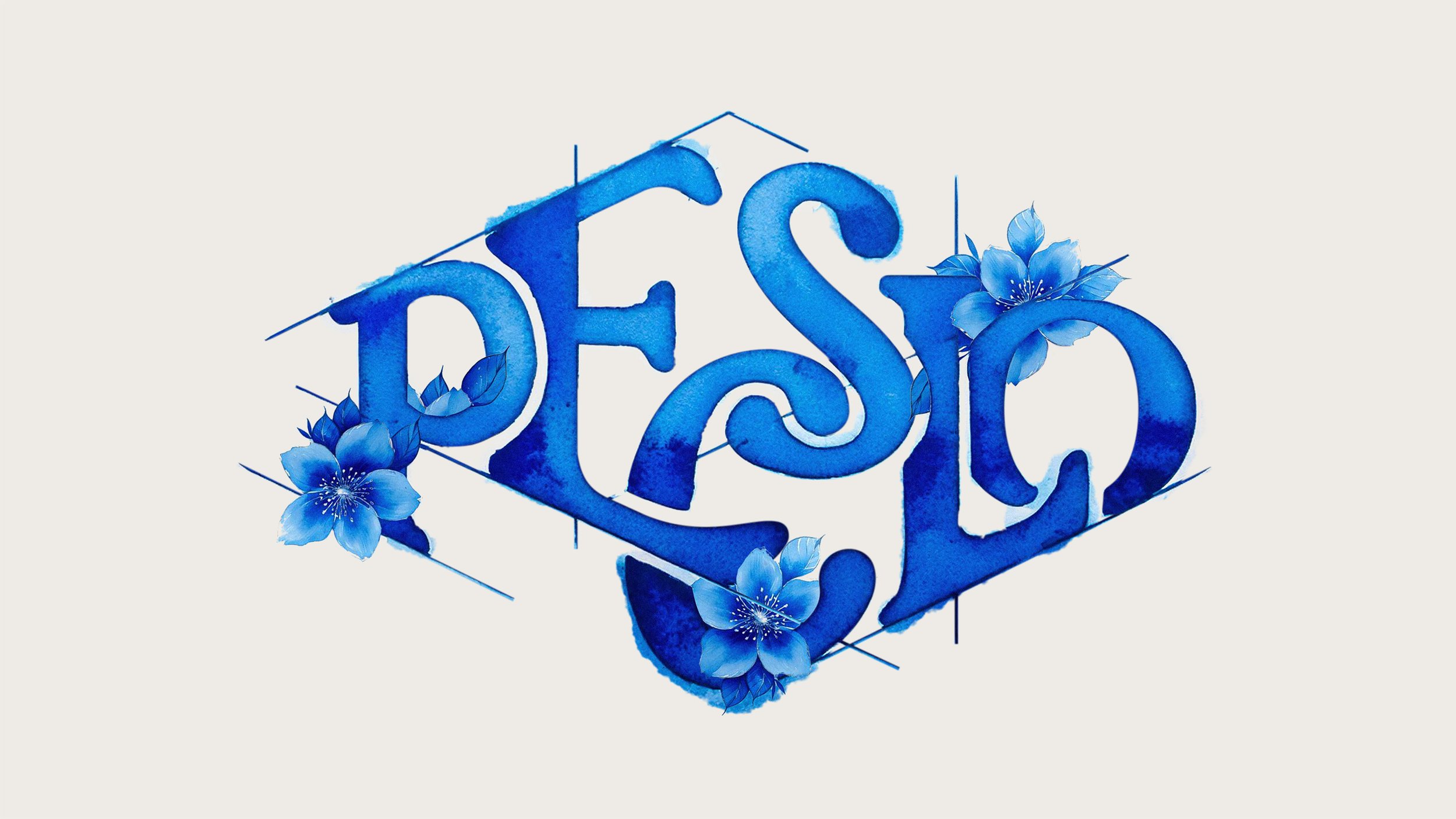
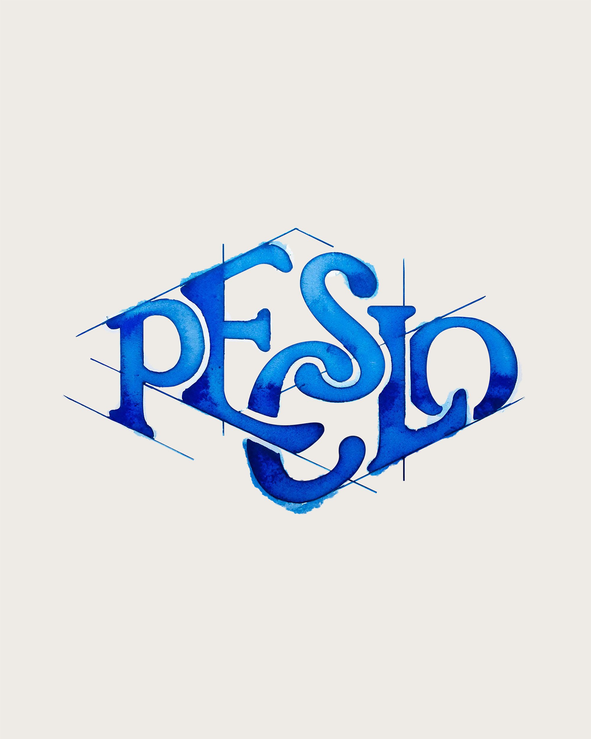
With watercolor texture and lines of construction, I wanted to give the design a natural, handmade feel—something entirely in keeping with the concept of an International Collective of Artists. It's capturing the process of art and the raw honesty of what goes on behind it.
The wording really spoke to me because it captures the community-driven essence of streetwear and the shared appreciation for art, design, and creativity. I love seeing more young people get involved in fashion and design, uniting over their passion and building a creative community. This article is proof of that movement—uniting people over their love for creativity.
Layout
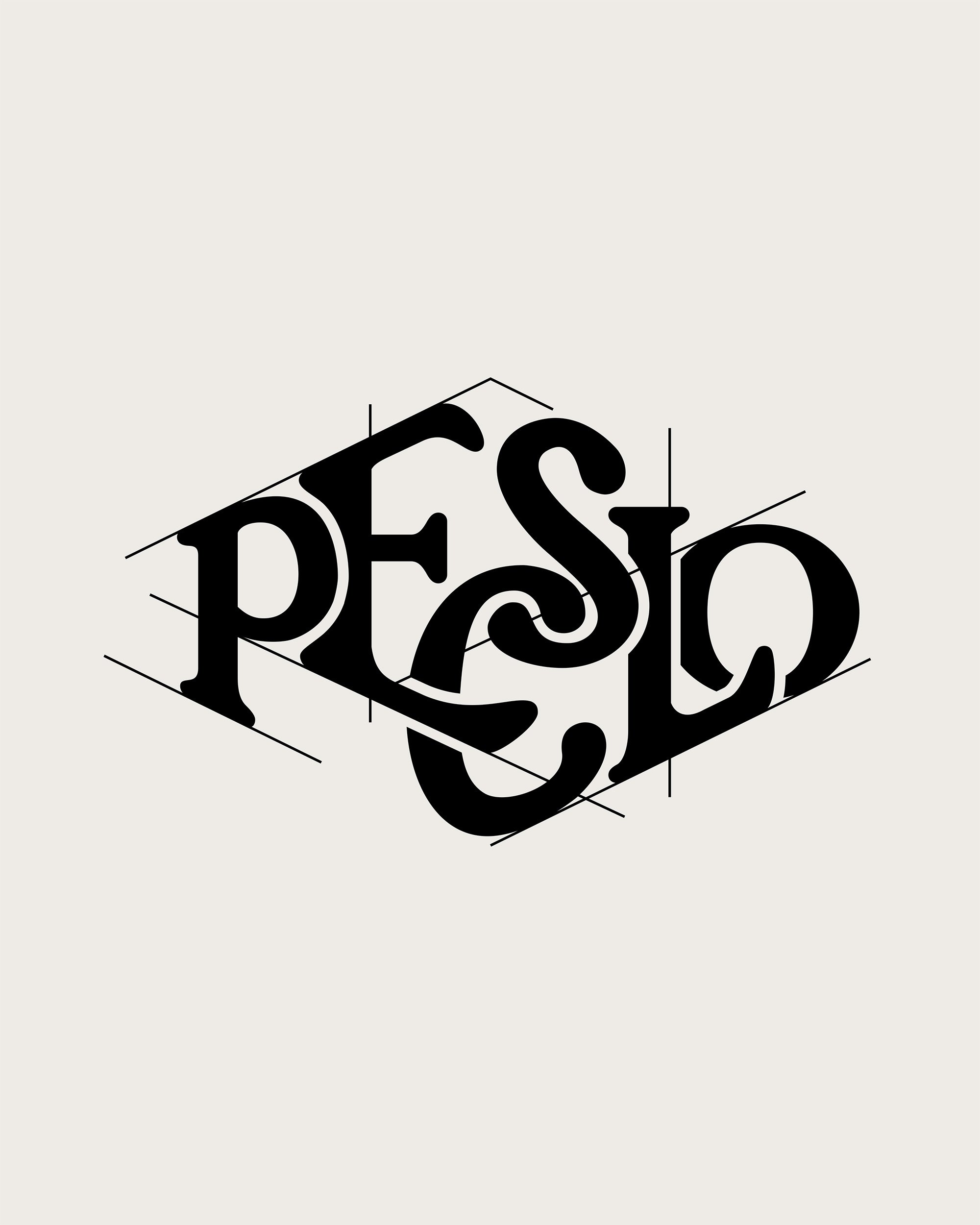
I started the process of producing this piece of artwork by undertaking a rough pencil sketch on paper. I mapped out the layout of the letters, positioning them in a diamond shape. With the overall design decided, step two was to select a suitable typeface.
I wanted to use a serif font that was elegant but not overly so—something that would complement the hand-drawn aspect of the design rather than make it look too polished. After I had determined the typeface that I would use, I began working the letters into my initial sketch. This consisted of laboriously stretching and distorting the characters in a way that would maintain legibility but allow them to flow properly in the shape.
Once the last letter composition was settled, I drew some whitespace around them to prevent overlapping and ensure the legibility of the design. As a finishing touch, I drew in construction lines, emphasizing the handmade look and underscoring the design process that went into the artwork.


Final Composition
To achieve the watercolor appearance, I uploaded the completed letter layout to Adobe Firefly and used it as a composition guide. Thanks to this setup, the result was an exact representation of my layout.
Final adjustments were made in Photoshop, where I refined details, corrected small imperfections, and masked in the flower elements to complete the composition.
Disclaimer
This is not an official design. I created this artwork purely as a portfolio piece and as a tribute to the brand. This project was made solely for creative expression and is not intended for commercial use.


