
Project Summary
Eightyfive Spring/Summer ‘24 - Neutral Tones
For Spring/Summer '24, Neutral Tones, I developed a number of prints that reflect the new aesthetic of the brand. Departing from the graphic streetwear aesthetic previously associated with Eightyfive, this collection is softer and easier going in its sensibility. The garments are focused on understated sophistication, universal shapes, and a neutral color palette that gives rise to a cohesive, urbane appearance.
In the subsequent sections, I shall examine the individual prints, detailing the creative process of each and how they constitute the collection's visual identity.

EF Monogram
Eightyfive had long envisioned a traditional monogram or lettermark which would be easily added to future collections. The goal was to create something streamlined and versatile that would be ageless.
The monogram boasts a stunning serif E, paired with a script F whose swash organically flows around the stem into the bar of the E, creating a stunning and harmonious design. I began by sketching out initial concepts and crafting the first digital mockup, selecting the correct typefaces, reducing the form and letter relationship, toning down the structure. The final details were implemented by the senior graphic designer, resulting in a neat and well-designed result.


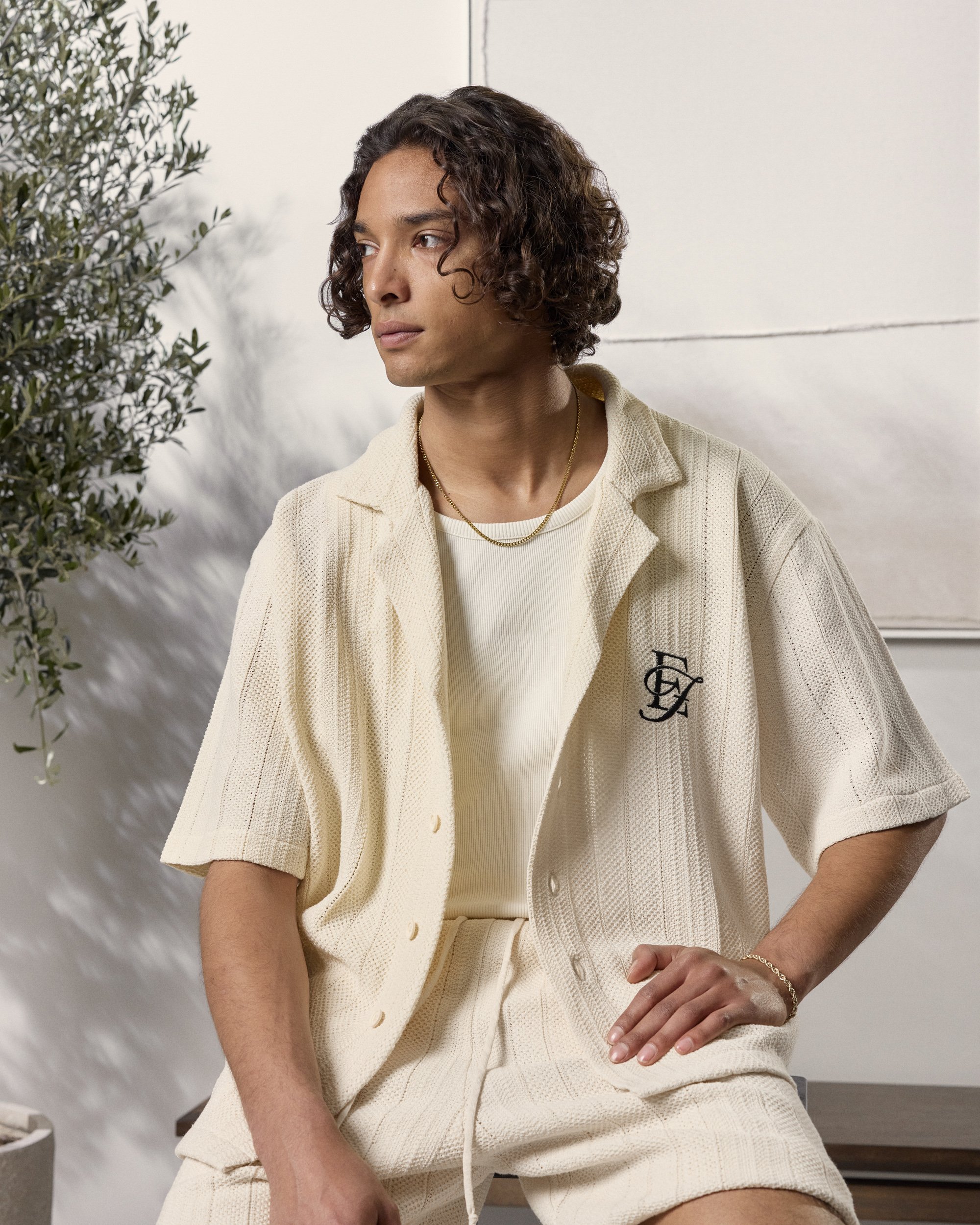
Knit Shirt (Spring/Summer '24 - Neutral Tones )
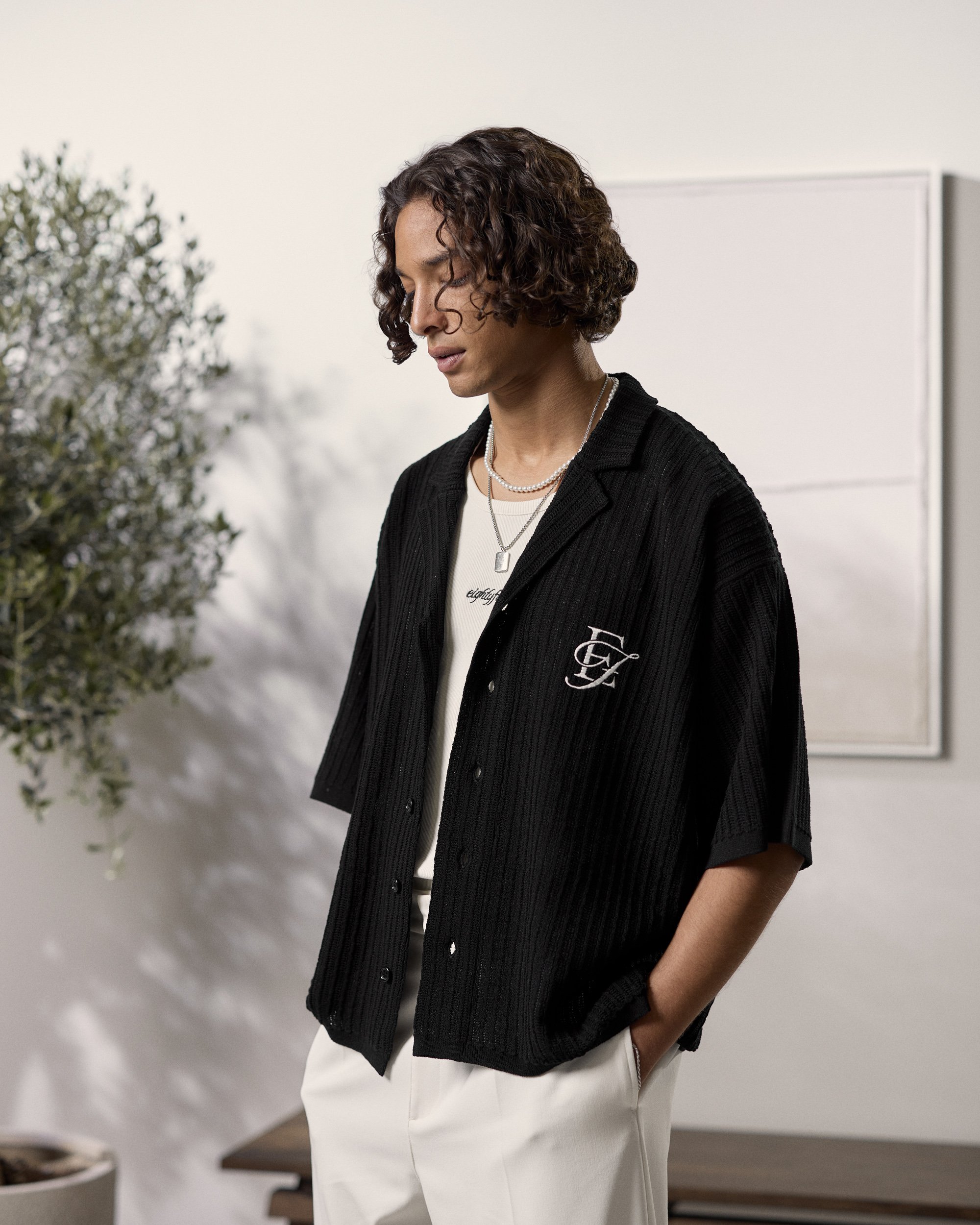
Knit Shirt (Spring/Summer '24 - Neutral Tones )

Knit Cardigan (Fall/Winter '24 - Serene Peaks)
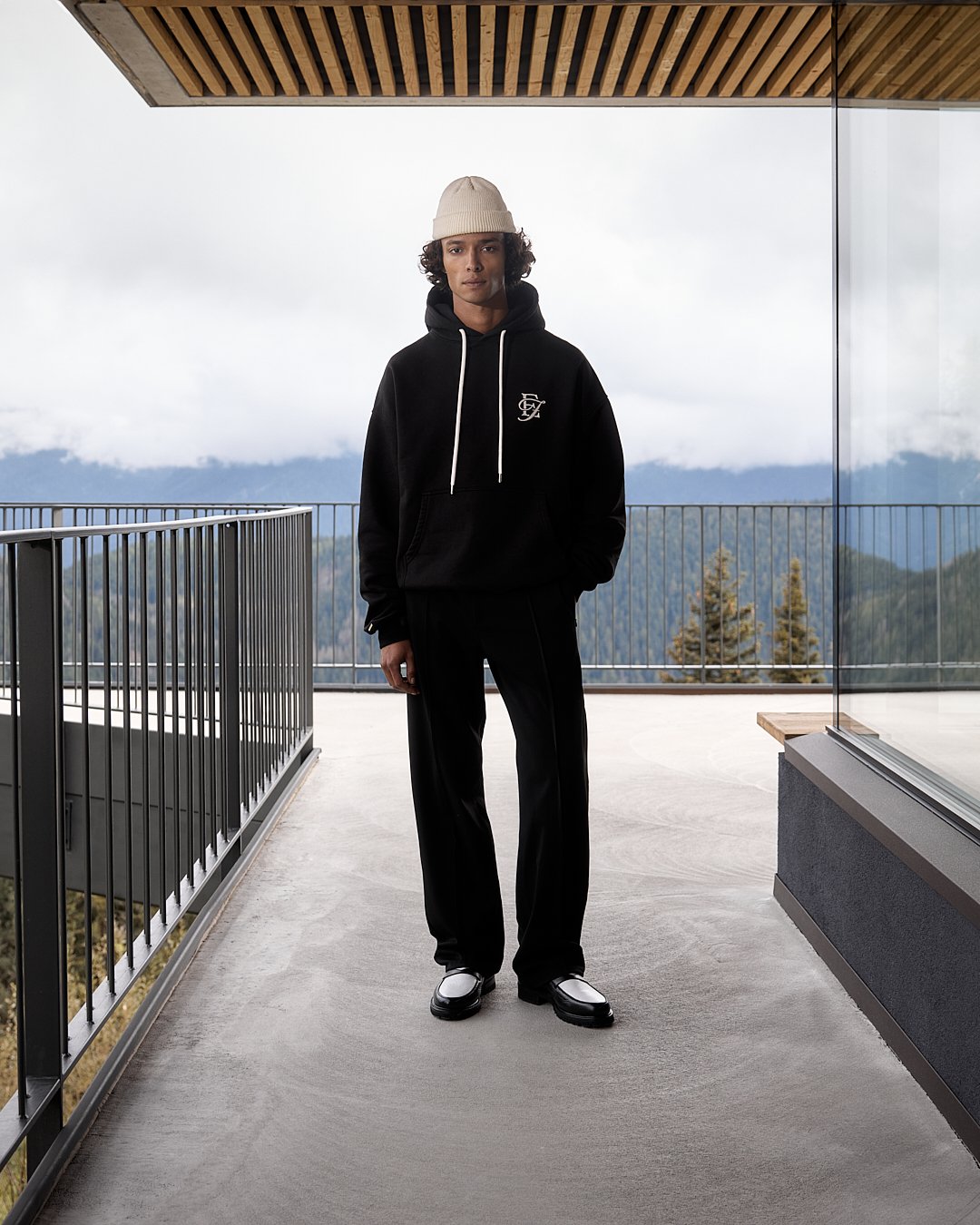
Contrast Hoodie (Fall/Winter '24 - Serene Peaks)
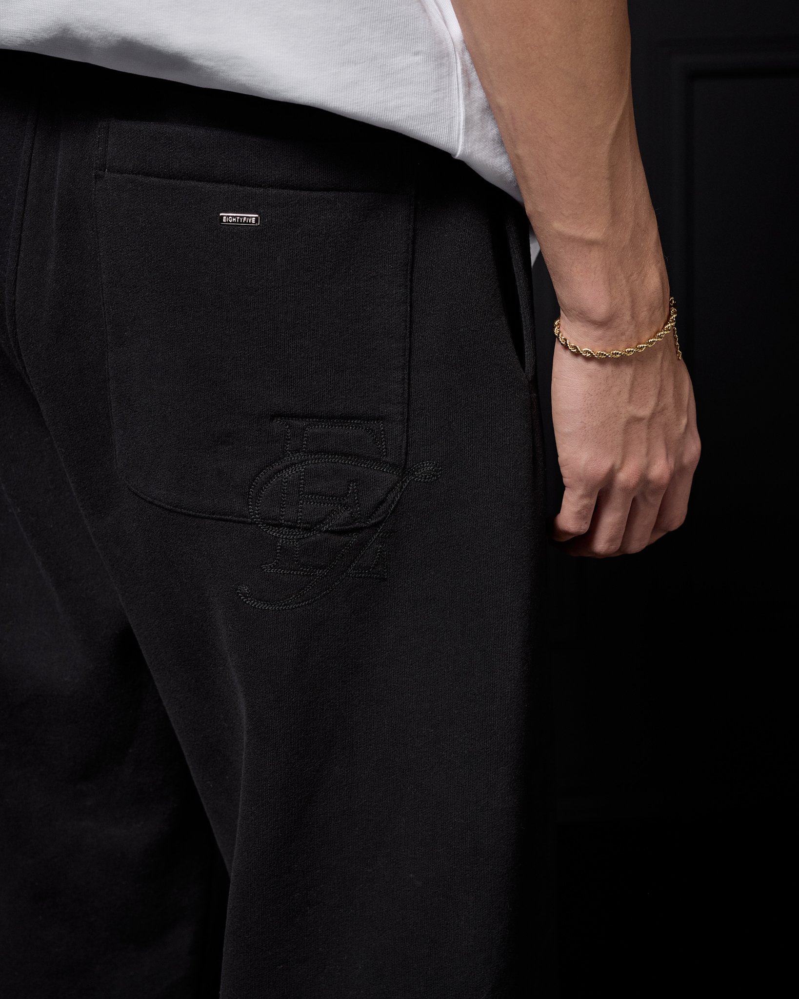
Embroidered Sweatpants (Winter '24 - Studio Collection)

Car Coat (Spring '25)
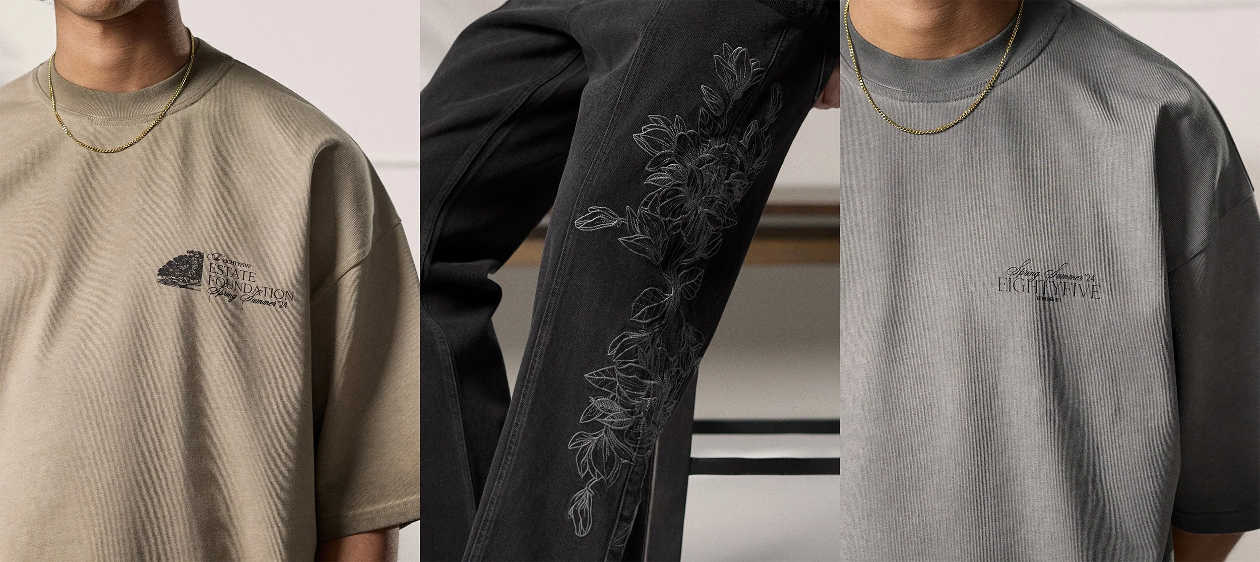
Flower Pattern
As mentioned before, this range is a clear deviation from the traditional streetwear, towards a softer and more refined aesthetic. To capture this, we focused on the use of more mature and versatile imagery for the graphics. Flowers were used as a recurring motive throughout the range, adding a soft yet refined touch. I especially love how this pattern moves so effortlessly along the side of this denim piece.

Smaller Artworks
Below, you'll find two smaller complementary artworks I created for this collection. While they are similar in style, each offers distinct differences to provide some variety across the garments they appear on.

As you can see, both designs share the same typographic foundation and both utilize the same typefaces as the staple. I love the idea of having two similar yet not quite the same prints on various colorways of the same shirt with certain unique details making each print unique.
The first artwork was a collaborative effort—one of my fellow students did the text and text elements that are arranged, and I did the image on the left and the overall design.
