As part of my apprenticeship, I had the opportunity to lead the redesign of Eightyfive's online shop, a project aimed at elevating the brand’s digital presence to match its luxurious, high-end identity. The core objective was to create a modern, visually stunning design that reflected the premium quality of the brand, while also driving significant improvements in user experience and conversion rates.
By focusing on key areas such as the product pages, product overview, landing pages, and the shopping cart, I was able to strategically optimize these essential touchpoints for better usability and performance. My goal for this project was for the redesigned site not only to enhance the overall aesthetic but also delivers a smoother, more intuitive shopping experience — ultimately leading to a measurable increase in conversions.
In this article, I’ll walk you through the design process and how each aspect of the redesign contributed to the brand’s goals. Through mockups, before-and-after comparisons, and an interactive video walkthrough, I’ll showcase the transformation of the site.

As part of the redesign, we focused on addressing three key pain points that were negatively impacting the user experience on the old site: the search functionality, the product page, and the shopping cart. The original user experience was not ideal, with an outdated UI that caused friction and frustration. Our objective was to resolve these issues and provide a seamless, user-friendly experience that would ultimately lead to improved conversion rates.

Search Function
Previously embedded within the hamburger menu, the search function was not visually integrated with the rest of the site, making it cumbersome and difficult to use. The redesigned search function is now seamlessly integrated into the header bar, making it easy to access via a simple icon. The products shown in the search results mirror the layout of the regular product overview/category pages, creating a more cohesive experience. Real-time search updates suggest products as the user types, and search term suggestions are also displayed to simplify the process.
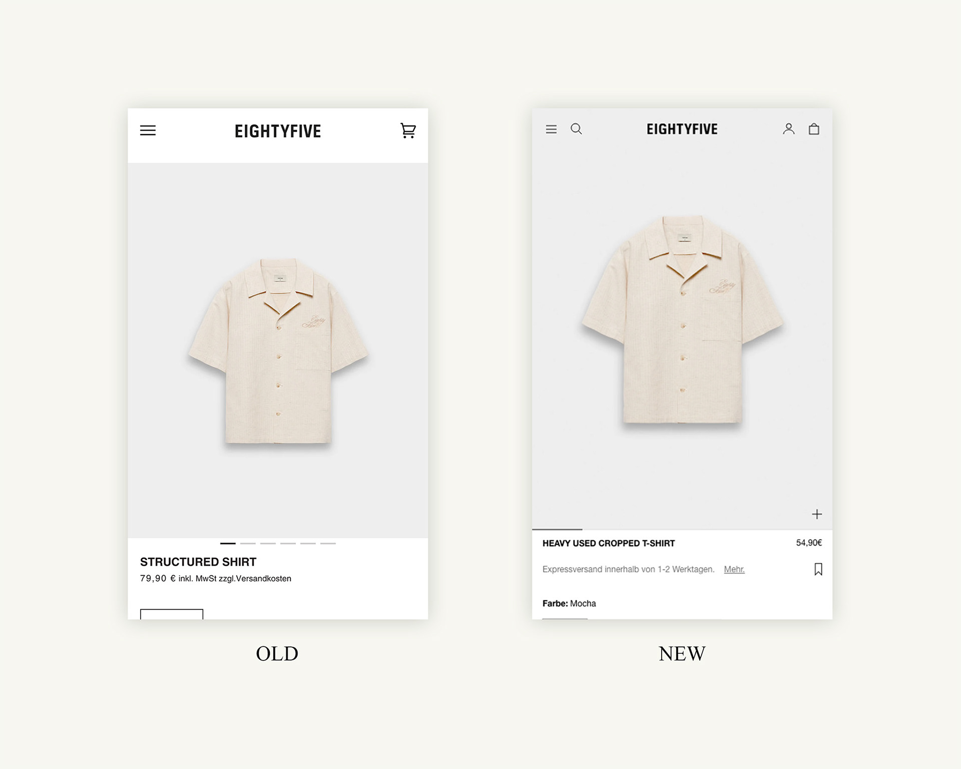
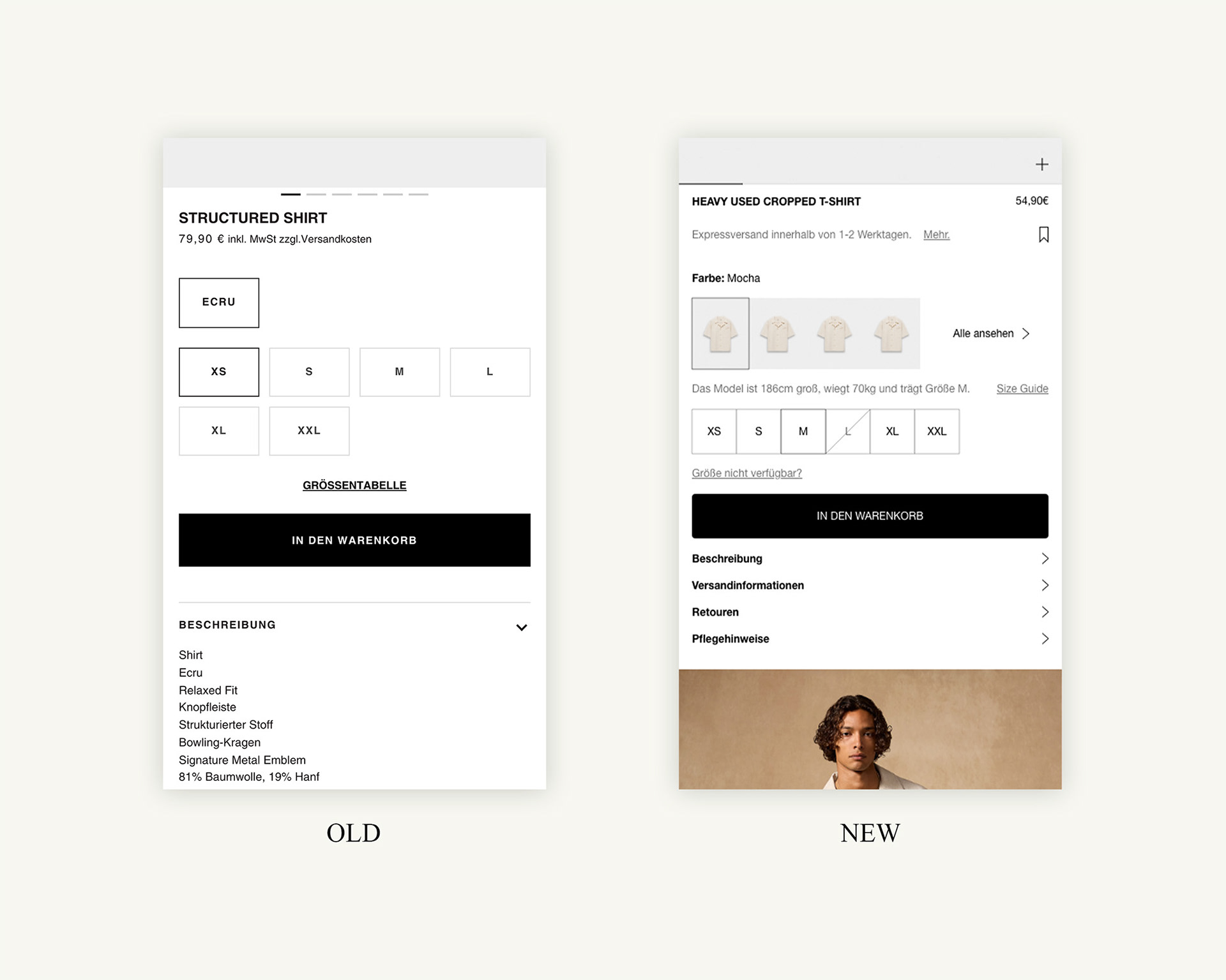
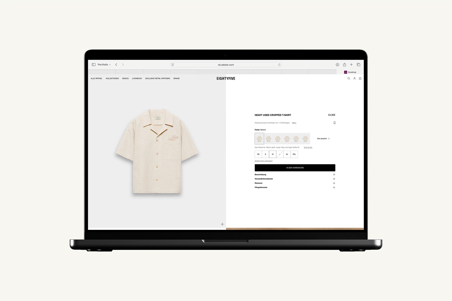
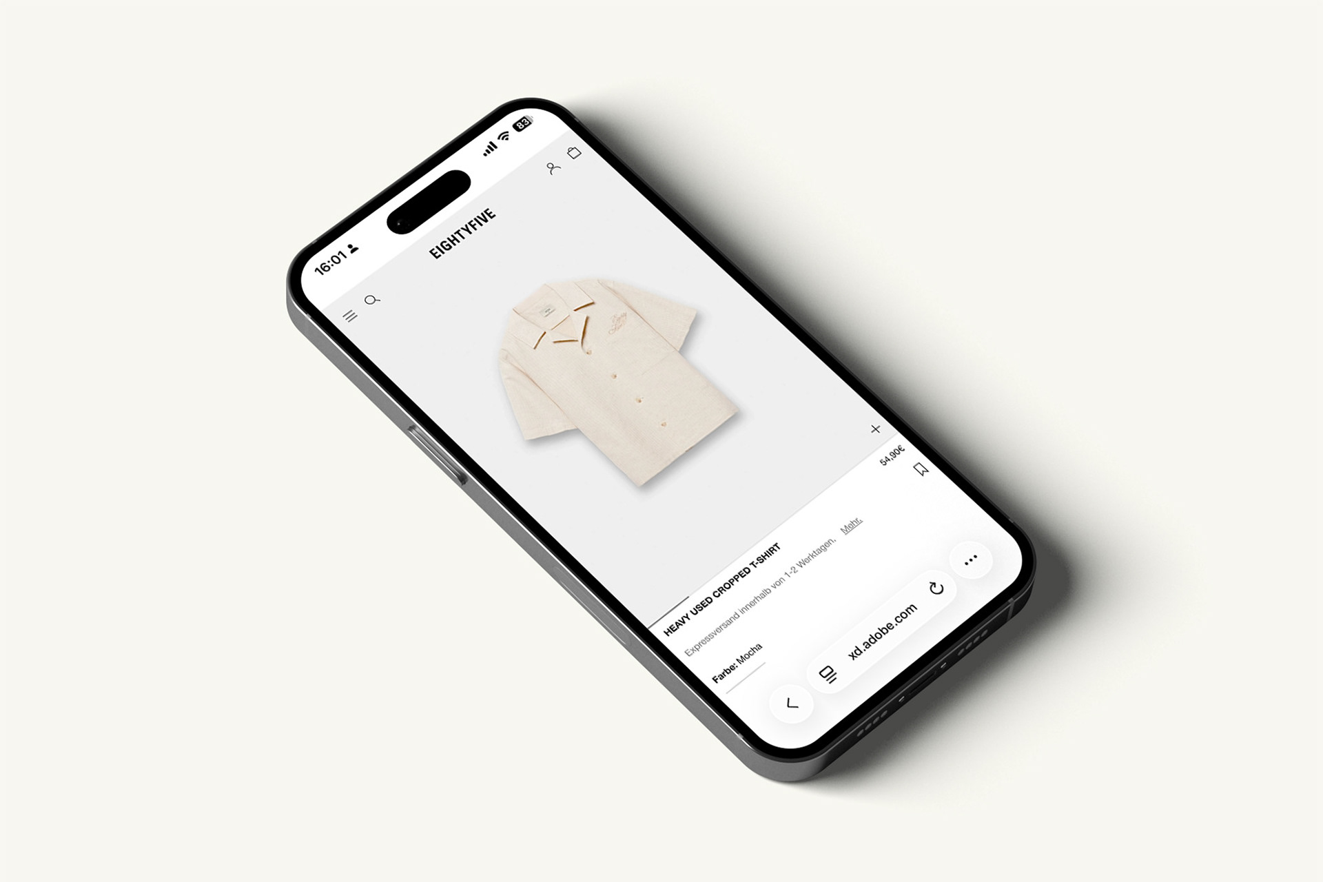
Product Page
As the most crucial page of the site, the product page had to deliver a smooth, intuitive experience, especially for users arriving directly via Meta Ads. The UI has been significantly modernized, with a cleaner, more user-friendly design. Product color variations are now displayed with icons, and express shipping is clearly highlighted at the top of the page. Additional features include an expandable menu for products with multiple color options and a notification system for out-of-stock sizes, enhancing user engagement and satisfaction.
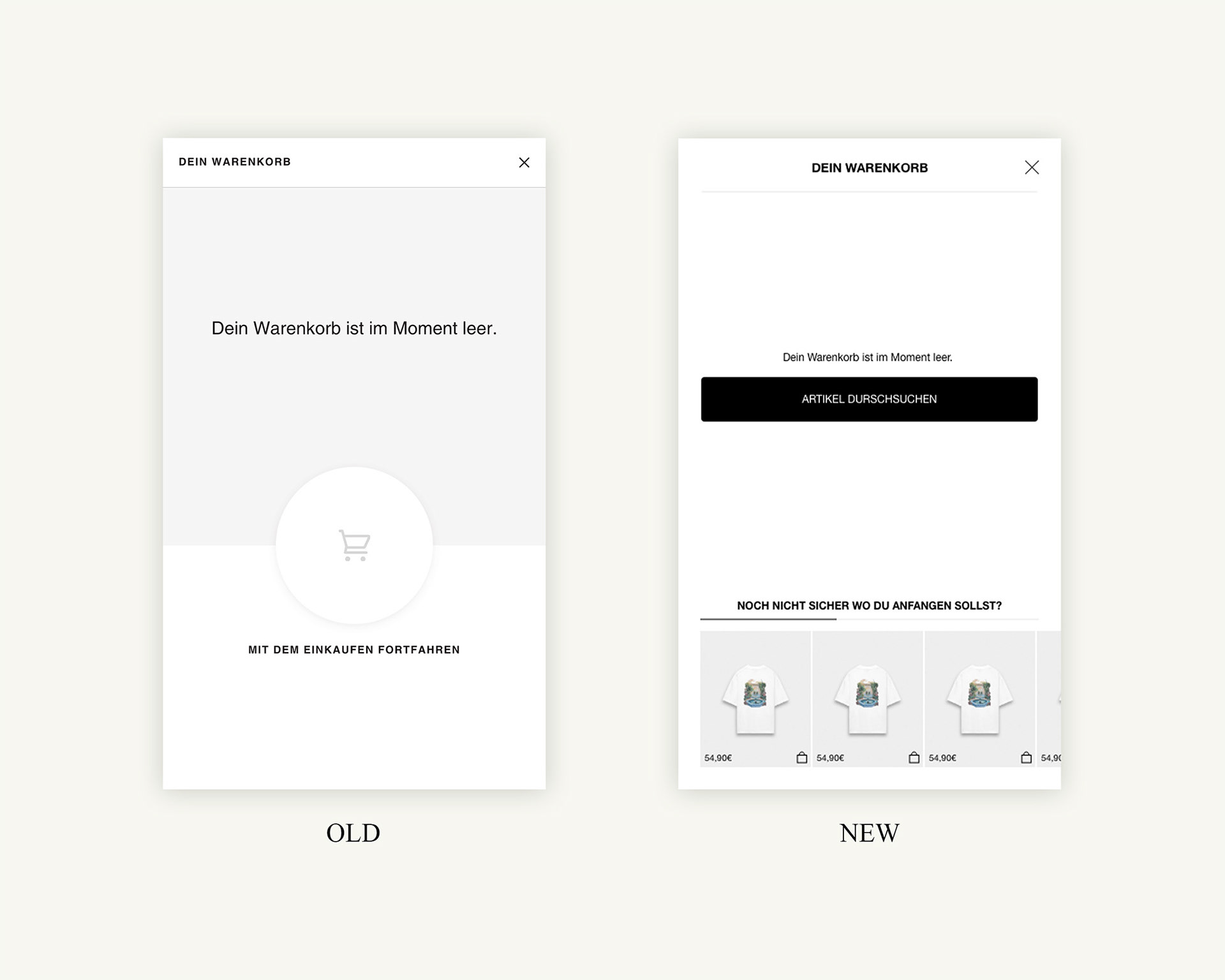
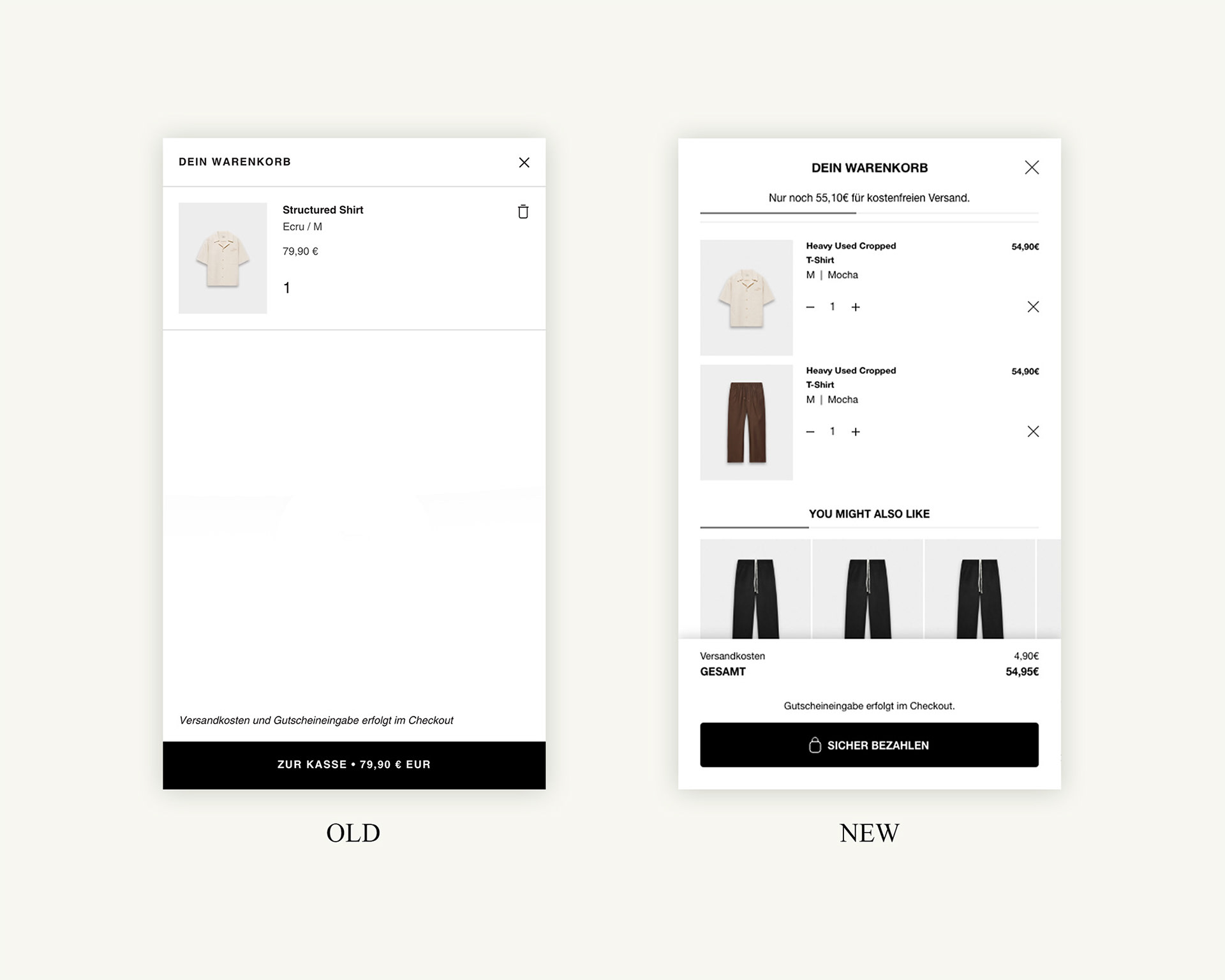
Shopping Cart
The shopping cart is another critical touchpoint in the user journey. In addition to the modernized UI, I focused on adding small yet impactful elements to increase conversion rates. A progress bar now shows users how close they are to qualifying for free shipping, while relevant product suggestions are offered in the cart to encourage additional purchases.

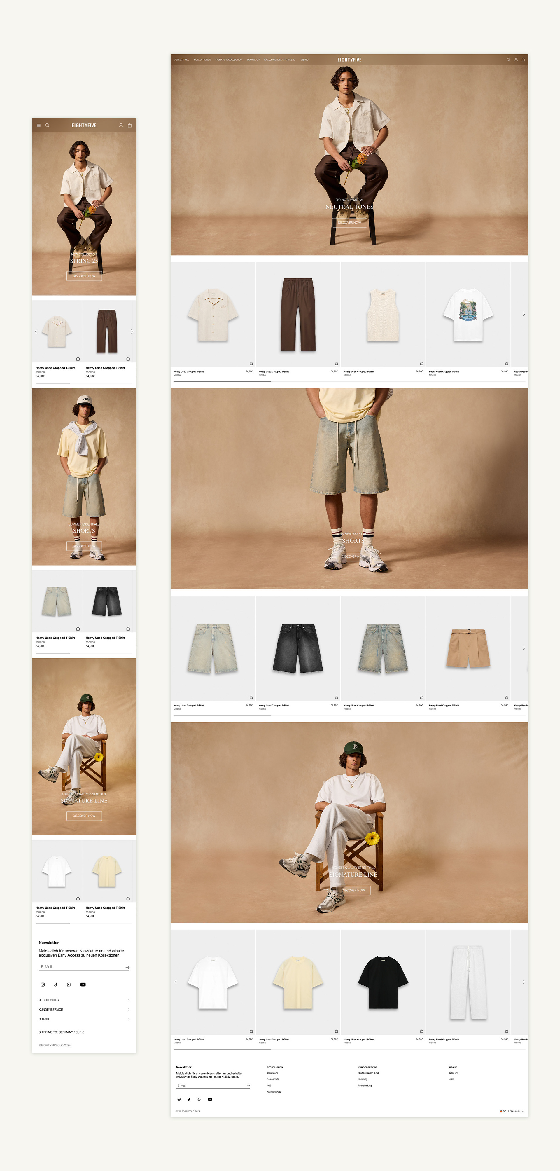
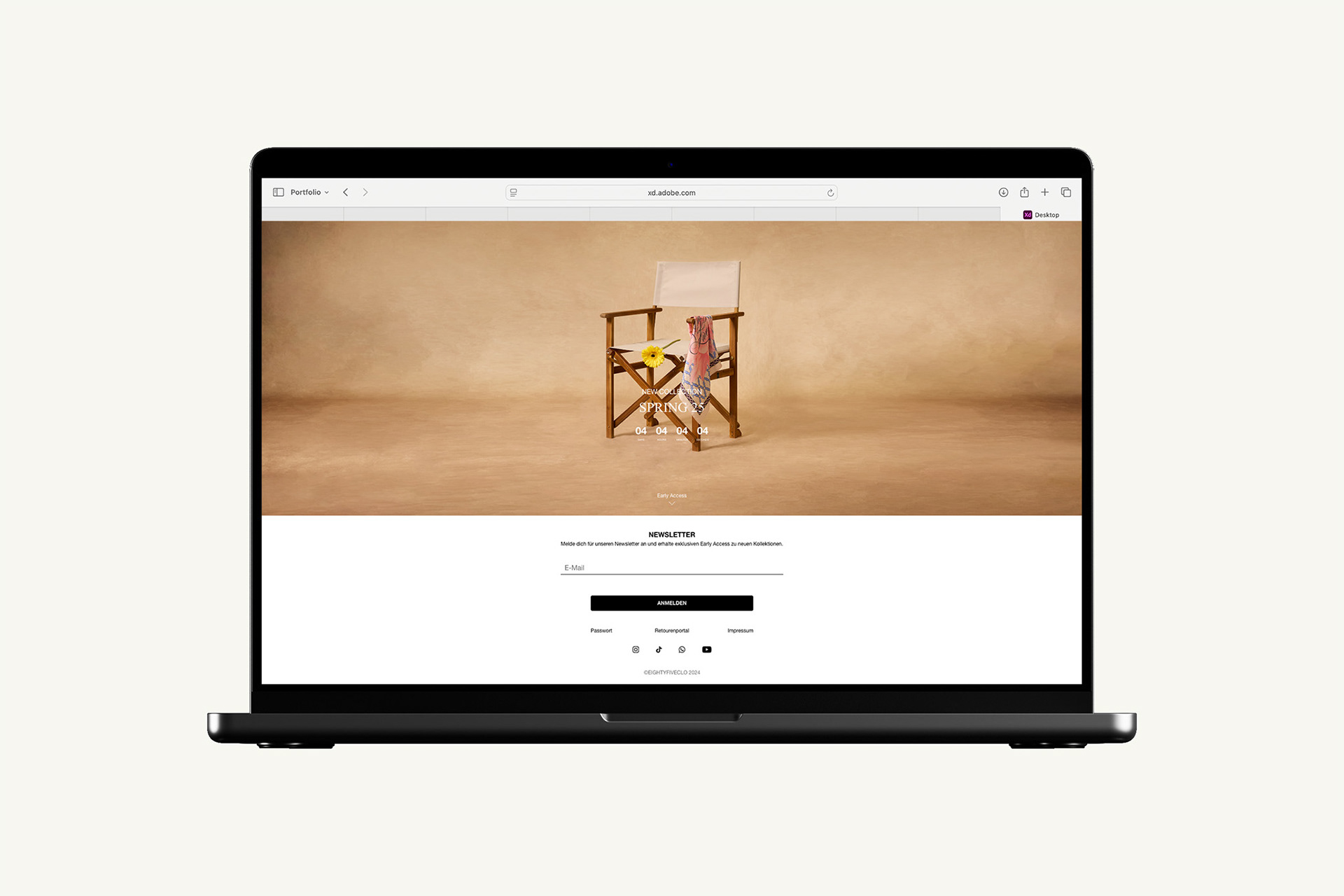
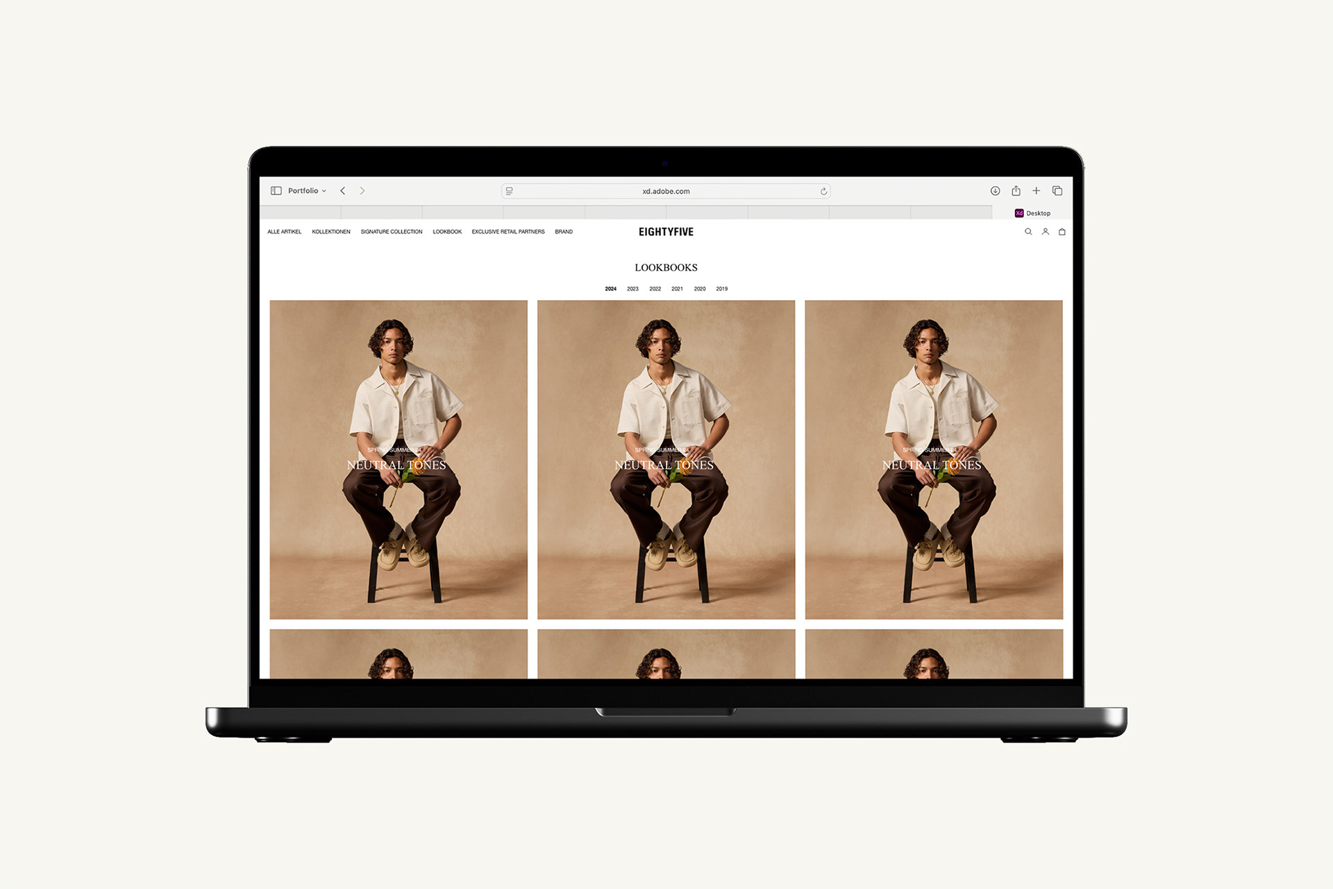
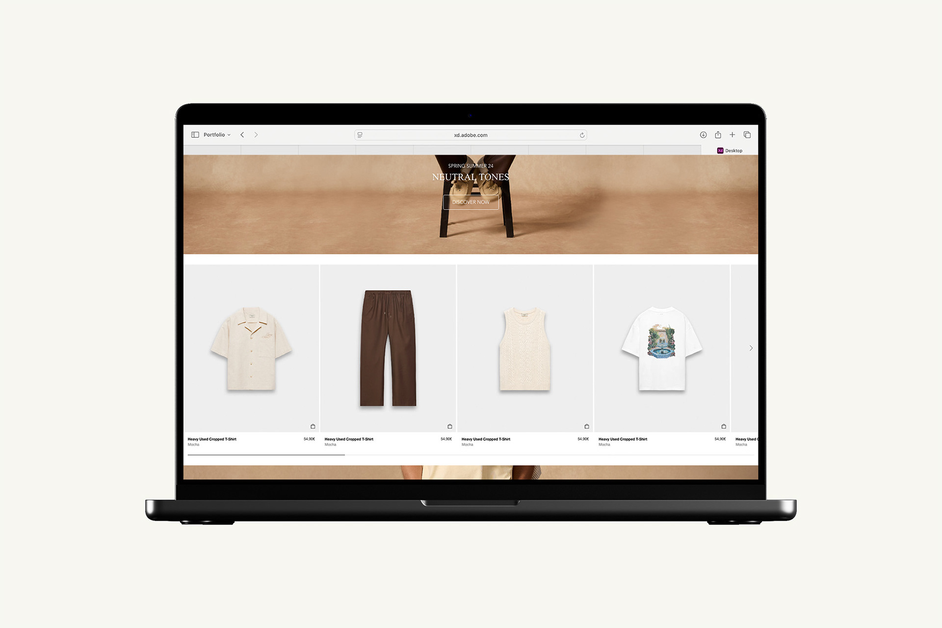
Responsive Design
Responsive design was a central element of the redesign, as nearly 90% of users access the site through mobile devices. However, the desktop version remains crucial for the overall feel of the site. A well-designed desktop experience is important, and it was essential to create a seamless package that works beautifully across all devices.
The redesign followed a "mobile-first" approach, focusing on ensuring that the mobile version of the site would be intuitive and user-friendly, given that it accounts for the majority of traffic. At the same time, the larger screen space available in the desktop version gave me the freedom to get creative and explore new design possibilities. I was able to integrate more layout options and refine the design with larger visual elements and additional details.
The goal was for the desktop version to stand out visually, while still maintaining the core aspects of the design. The logic and functionality of the site needed to remain consistent across all devices. Whether users are browsing on a mobile phone or a desktop computer, the design and user flow should provide a uniform, clear, and seamless experience.