About the Project
For this project, I was responsible for creating the complete corporate identity for Feature, a leading multi-brand retailer based in Germany. From concept to execution, I worked independently during my apprenticeship to develop a visual identity that reflects the brand’s core values and mission.
Feature aims to offer not just premium fashion but a holistic lifestyle experience, curating exclusive brands for a discerning, global-minded audience. With locations in Hamburg, Hannover, Oberhausen, and Munich, the brand needed an identity that would resonate with diverse communities while maintaining its position as a high-end, boutique retailer. As Feature continues to evolve, it was essential that the new corporate identity effectively conveyed the brand’s dedication to quality, style, and a strong community ethos.
The challenge in creating this corporate identity was to translate these values into a cohesive visual language that would be reflected across all touchpoints. The CI needed to embody the brand’s sophistication and its curated selection of premium clothing, footwear, headwear, and accessories, while also reinforcing its commitment to building a vibrant and engaged customer community. By ensuring a modern, clean, and timeless aesthetic, the corporate identity underscores Feature's position as a forward-thinking, boutique-style retailer, while fostering lasting connections with its audience.

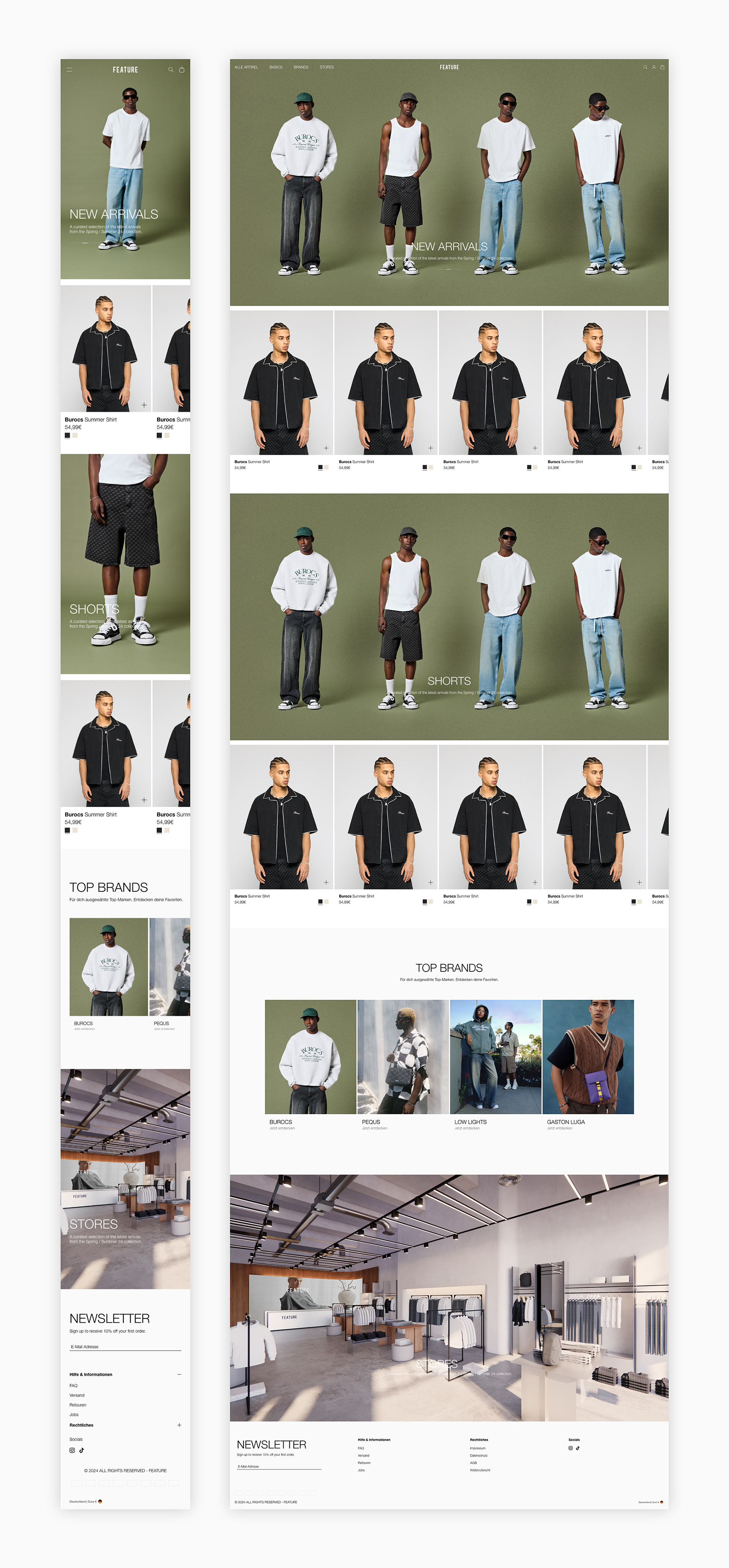
Typography
For the typography, I chose Helvetica Neue, specifically the Light and Bold weights. Light was selected as the primary typeface, while Bold is used for smaller sub-headers and occasional highlights. This decision was driven by the desire to create a refined and minimalist look, which perfectly complements Feature's identity as a high-end, curated retailer.
The thin character of Helvetica Neue Light conveys a sense of luxury and sophistication, making it an ideal fit for the context of Feature’s local retail stores. It’s subtle and not overpowering, allowing the store’s interior design and carefully curated brand selection to take center stage.
The choice to keep the typography understated was intentional. I wanted the brand to be represented through high-quality campaign footage and a minimalist design approach—one that exudes exclusivity and premium quality. By avoiding large, attention-grabbing fonts, the corporate identity feels more refined and cohesive, aligning with Feature's vision of offering an elevated shopping experience without being overly bold or loud.


Use of the Logo
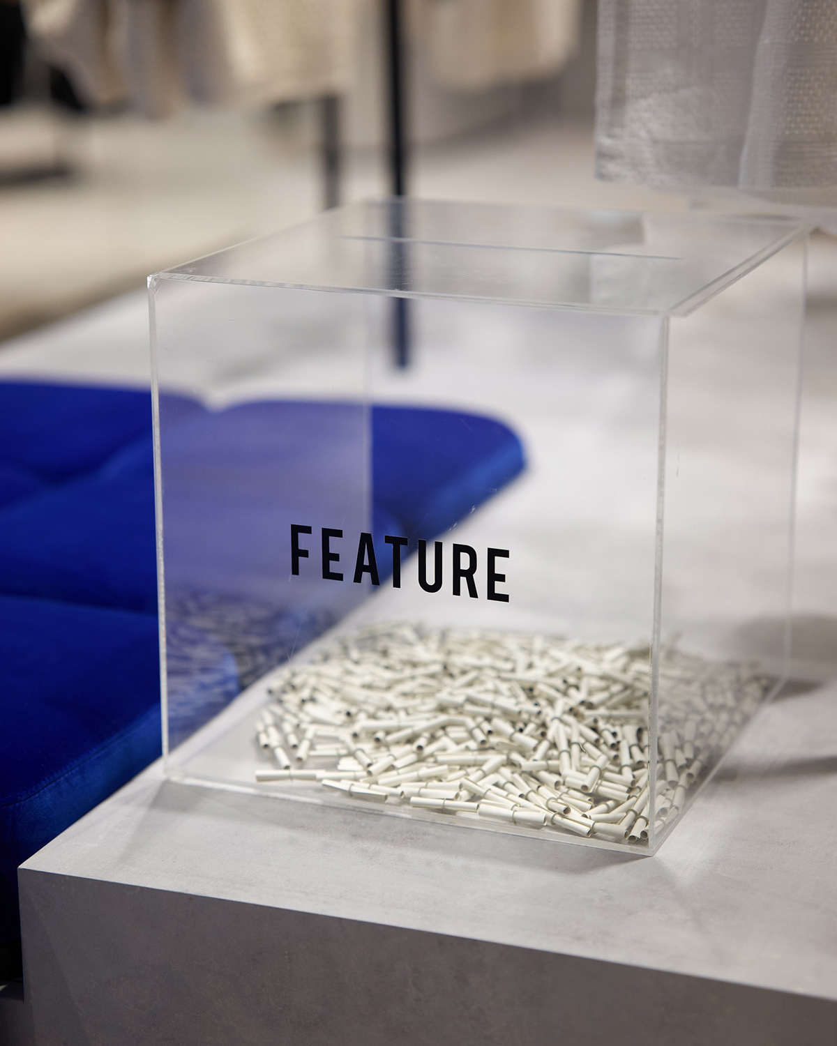
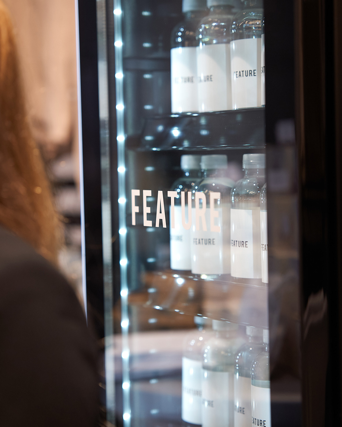
In addition to the typography, I intended for the Feature logo to serve as the primary visual element across all branding materials, with text being minimized wherever possible. While this is not always feasible—especially when conveying essential information—a strong type system is crucial, particularly in contexts such as social media communication and ads. However, to create a distinctive and memorable brand presence, I prioritized ensuring that the Feature logo remained the focal point, allowing it to drive the brand's recognition and positioning.
By keeping the text minimal, the logo can stand out, reinforcing Feature’s identity in a clear and impactful way. This approach also helps elevate the exclusivity and sophistication of the brand, making sure the focus remains on the premium, curated nature of the store's offerings while still allowing for efficient communication when necessary.

Color
For the color palette, I chose three neutral tones: Black, White, and a light grey #fafafa. The philosophy behind these colors mirrors that of the typography—understated and neutral to keep the focus entirely on the clothing and the interior of the stores. These subtle tones help create a clean, sophisticated environment where the attention is naturally drawn to the curated product selection.
In the physical stores, the palette works seamlessly with accents of blue and warm wood tones, combined with high-quality concrete and brushed aluminum, which enhance the modern and premium atmosphere. This approach allows the store’s interior to shine without overwhelming the space.
For the digital presence, these neutral colors were also ideal for presenting the clothing in the best possible light. They provide a balanced backdrop that ensures the products remain the focal point, allowing for a visually appealing and high-end user experience both online and in-store.

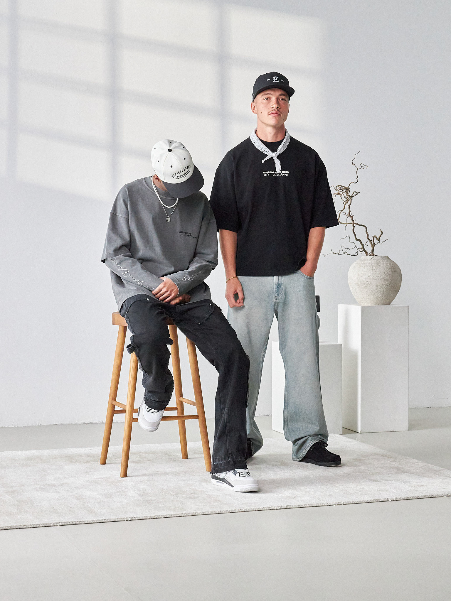
Social Media
For Social Media, the strategy emphasizes a minimalist and visually compelling approach to strengthen Feature's presence across platforms. The key points of this strategy are:
Minimal Text and Frames:
The visual content takes center stage. The goal is to reduce the amount of text and framing in posts to create a clean, modern aesthetic. This allows the product and brand to speak for themselves, offering a sleek and sophisticated appearance.
The visual content takes center stage. The goal is to reduce the amount of text and framing in posts to create a clean, modern aesthetic. This allows the product and brand to speak for themselves, offering a sleek and sophisticated appearance.
Highlighting High-Quality Campaign Images and In-Store Photos:
The focus is on showcasing premium campaign imagery and in-store photos of the clothing. This helps convey the boutique's unique atmosphere and reinforces Feature’s commitment to high-end fashion.
The focus is on showcasing premium campaign imagery and in-store photos of the clothing. This helps convey the boutique's unique atmosphere and reinforces Feature’s commitment to high-end fashion.
Increased Use of Brand Logos:
Brand logos are prominently featured in posts to emphasize the identity of the brands carried by Feature. This creates a consistent, recognizable branding experience across social media platforms and strengthens the connection between the retailer and its curated brands.
Brand logos are prominently featured in posts to emphasize the identity of the brands carried by Feature. This creates a consistent, recognizable branding experience across social media platforms and strengthens the connection between the retailer and its curated brands.
High-Quality Captions:
Each post is paired with carefully crafted, high-quality captions that align with the brand's tone and target audience. The focus is on concise, impactful messages that complement the visual experience, ensuring the content remains effective without overwhelming the viewer.
Each post is paired with carefully crafted, high-quality captions that align with the brand's tone and target audience. The focus is on concise, impactful messages that complement the visual experience, ensuring the content remains effective without overwhelming the viewer.
This approach creates a strong, cohesive presence that highlights both the quality of the products and the sophistication of the brand, ensuring that Feature stands out in the digital space.