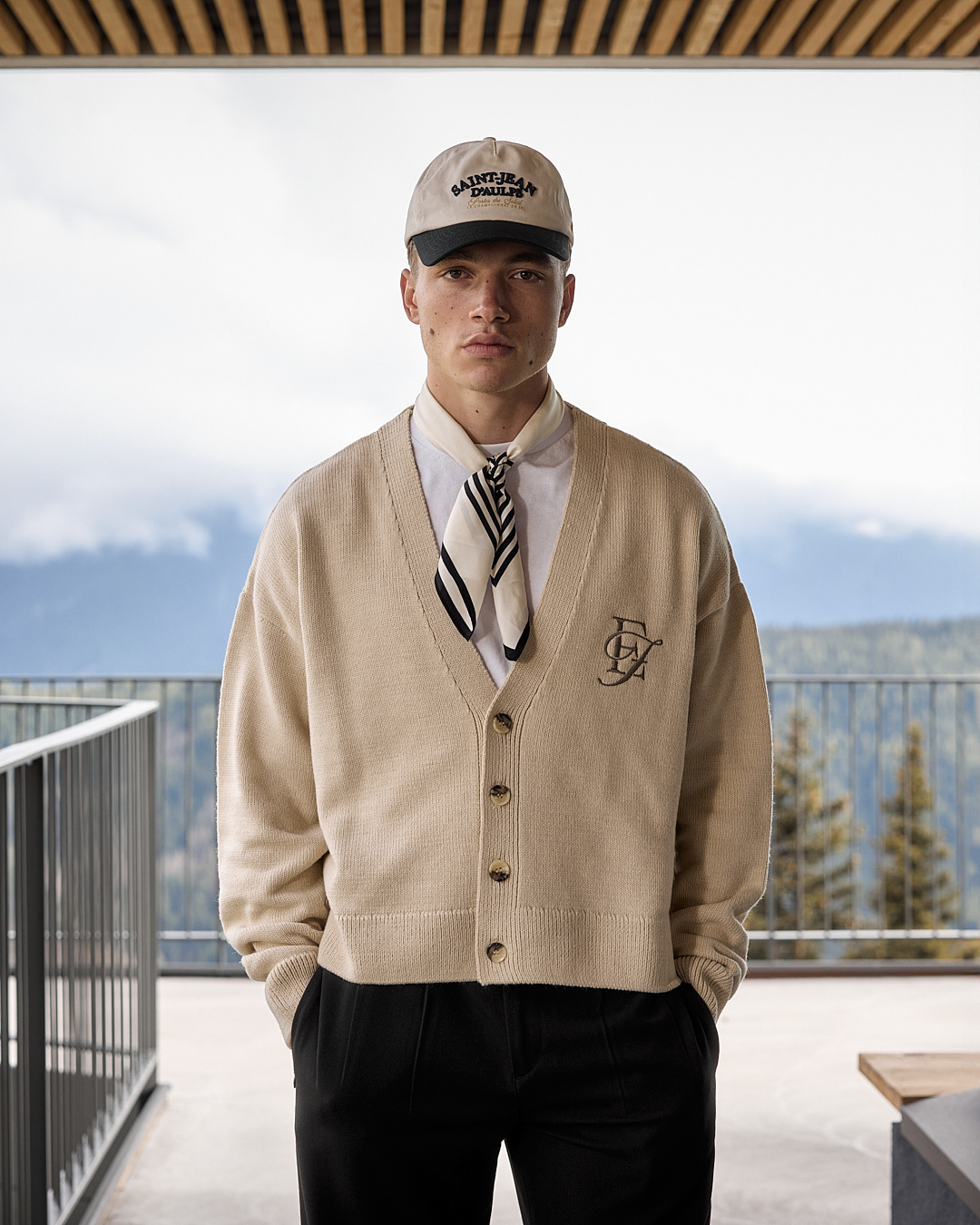
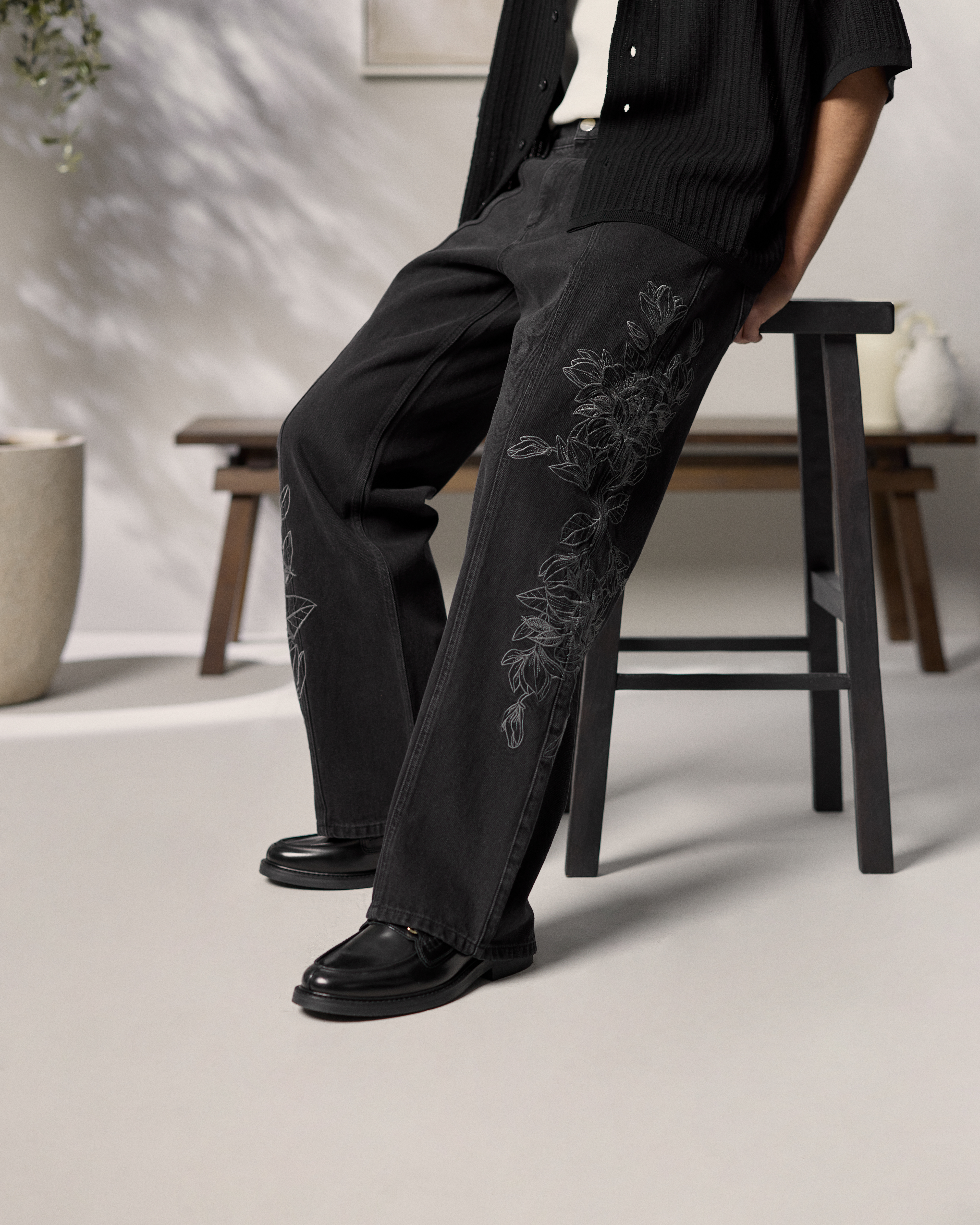
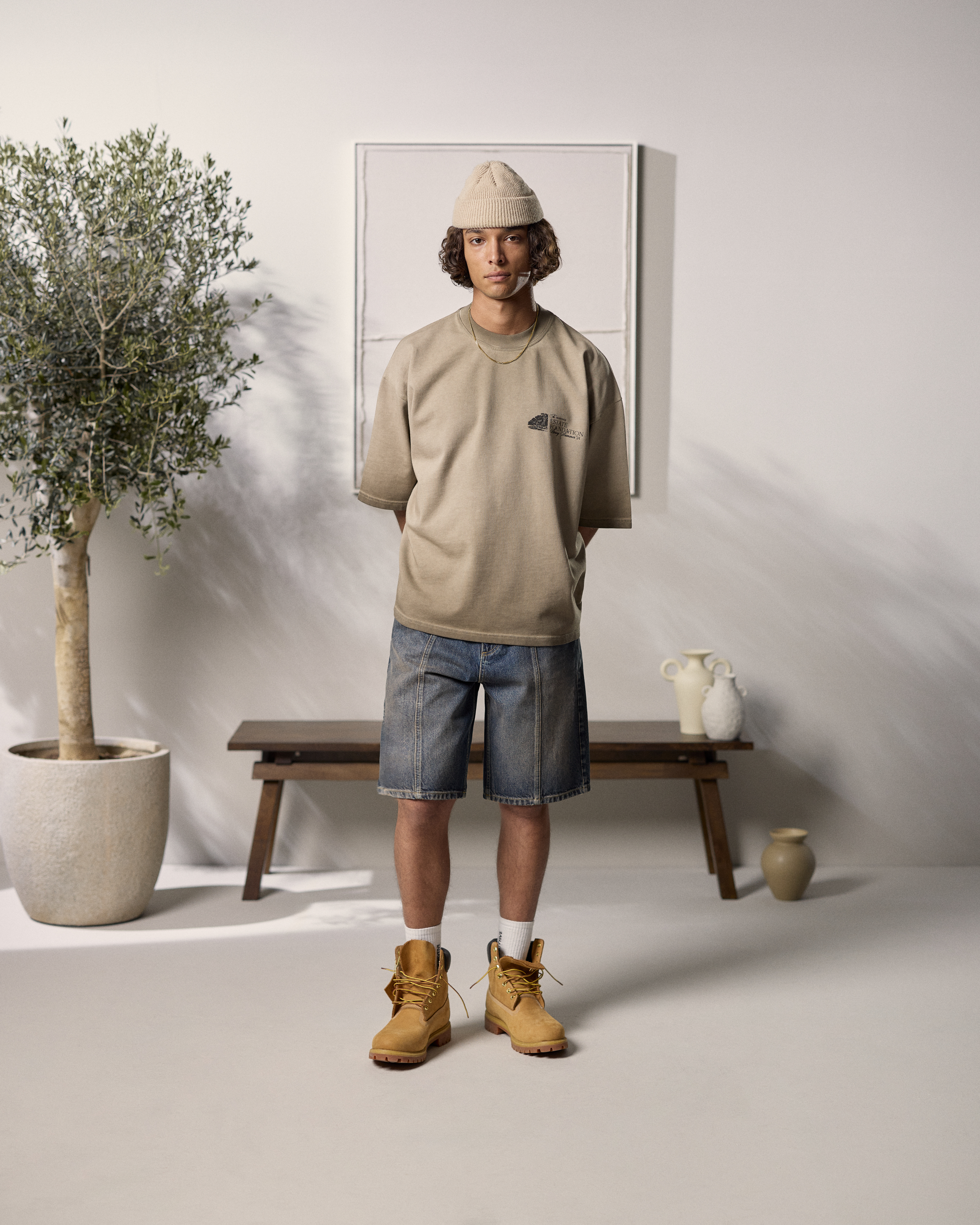
For Spring/Summer '24, Neutral Tones, I developed a number of prints that reflect the new aesthetic of the brand. Departing from the graphic streetwear aesthetic previously associated with Eightyfive, this collection is softer and easier going in its sensibility. The garments are focused on understated sophistication, universal shapes, and a neutral color palette that gives rise to a cohesive, urbane appearance.
In the subsequent sections, I shall examine the individual prints, detailing the creative process of each and how they constitute the collection's visual identity.
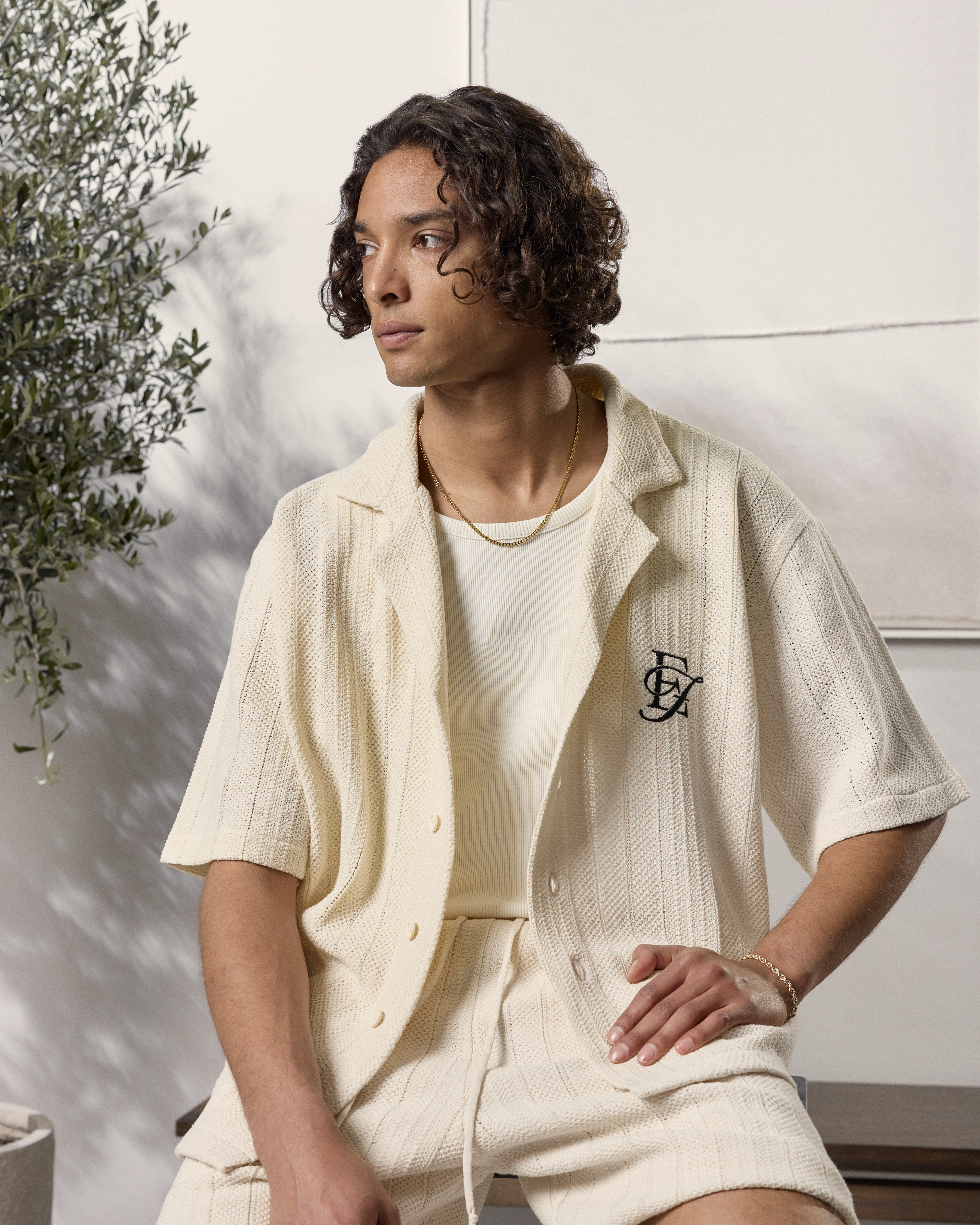
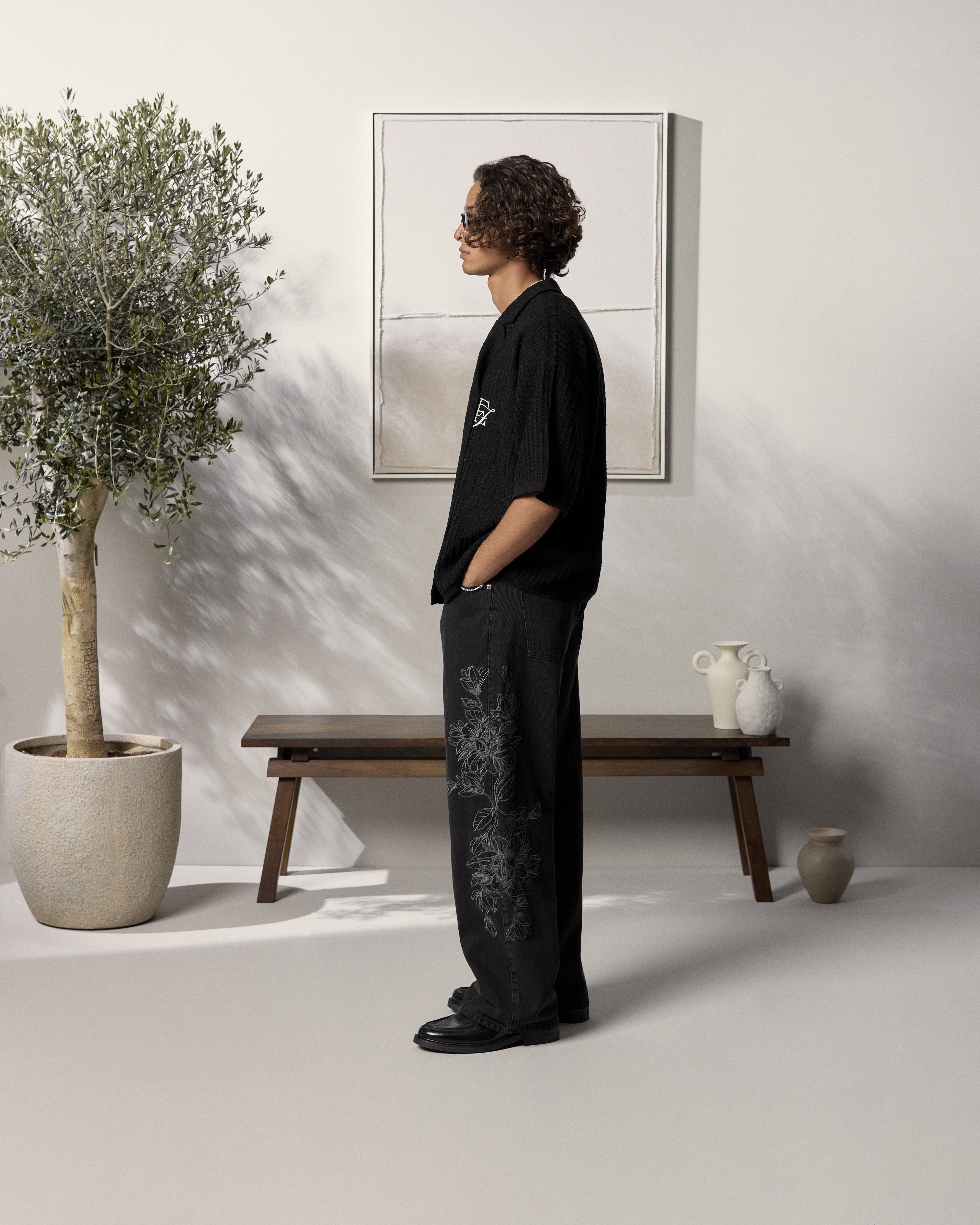
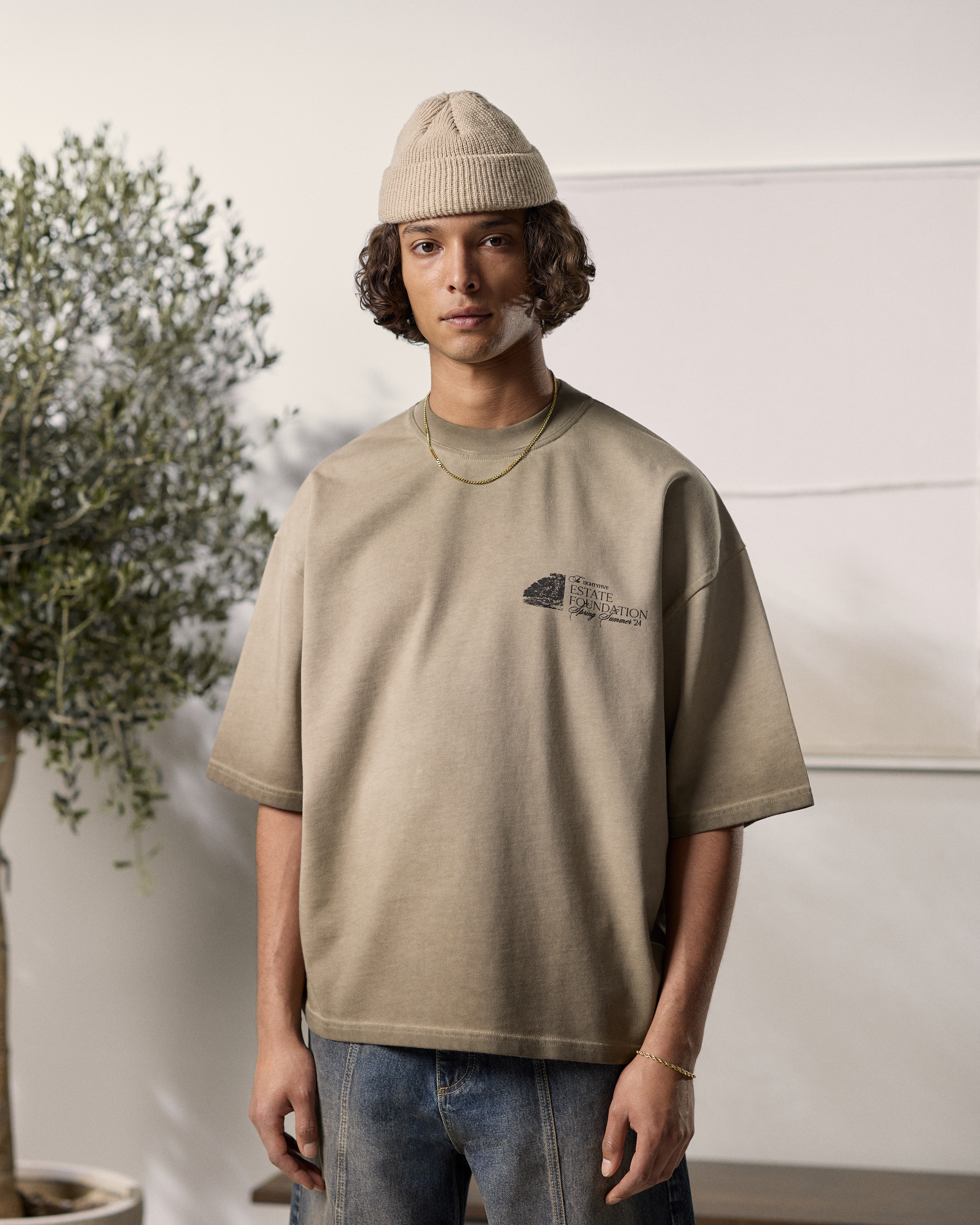

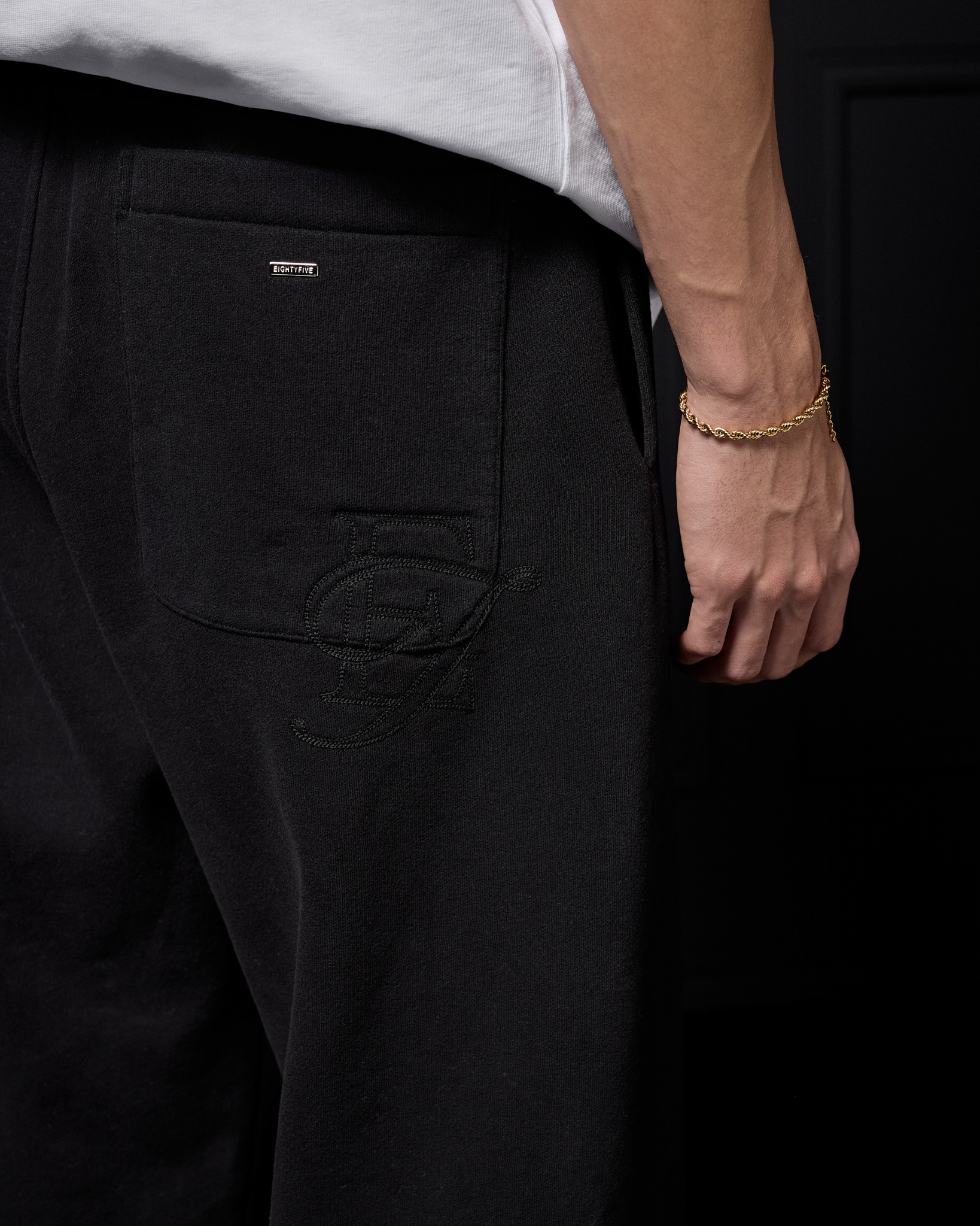
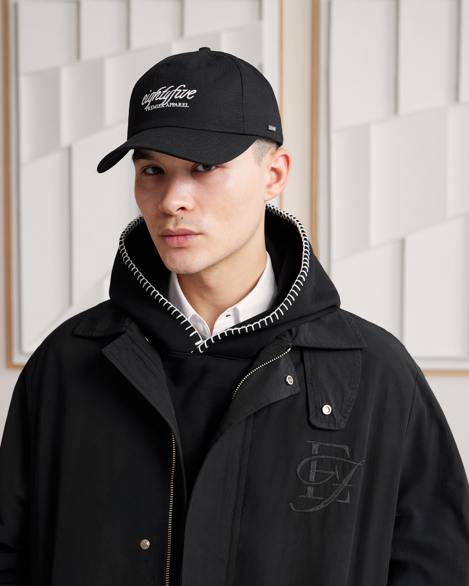
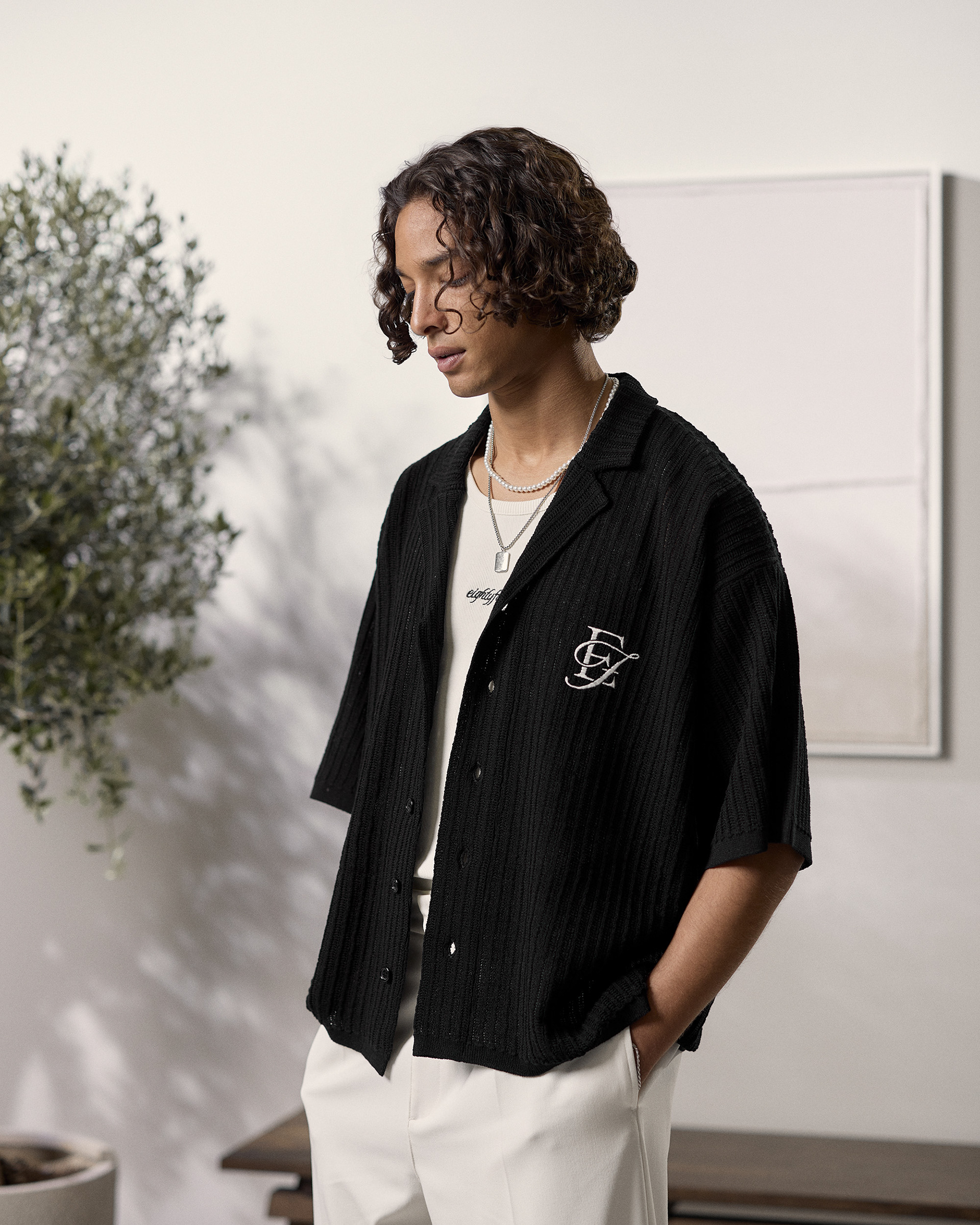
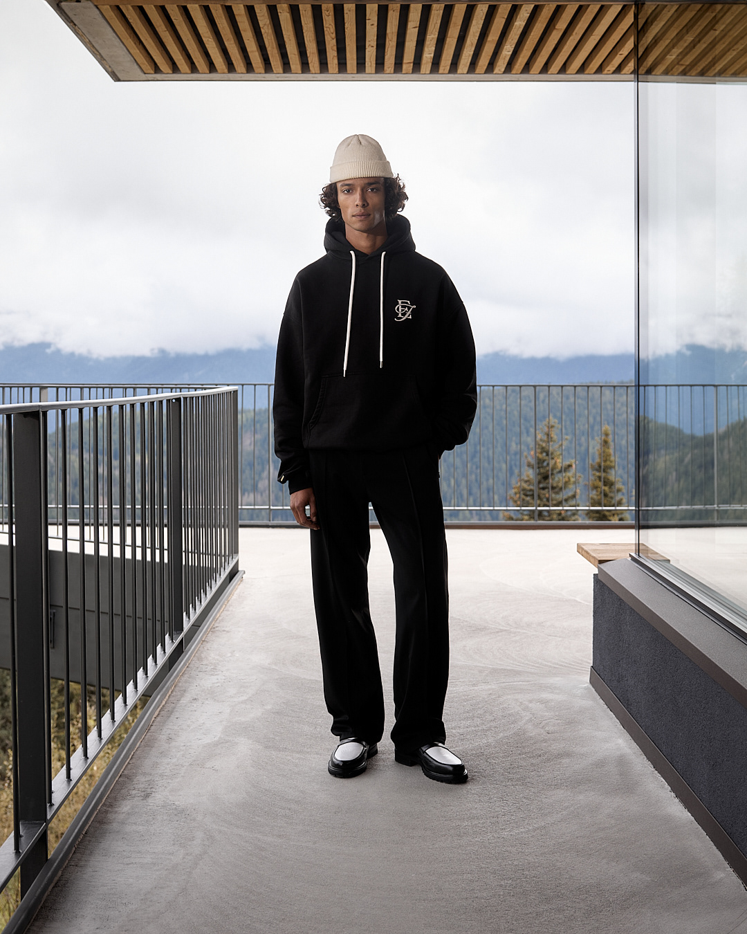
EF Monogram
Eightyfive had long envisioned a traditional monogram or lettermark which would be easily added to future collections. The goal was to create something streamlined and versatile that would be ageless.
The monogram boasts a stunning serif E, paired with a script F whose swash organically flows around the stem into the bar of the E, creating a stunning and harmonious design. I began by sketching out initial concepts and crafting the first digital mockup, selecting the correct typefaces, reducing the form and letter relationship, toning down the structure. The final details were implemented by the senior graphic designer, resulting in a neat and well-designed result.